Saturday 27 August 2016

Book Nerd Problems#10

I hate it when this happens.


I love symmetry and pretty arrangements. So, when the covers of the series do not match I get really irritated. And I end up buying the newer version with the matching covers. This happened with Shatter Me series by Tahereh Mafi. Have you seen the covers? They are like my all time favourites. But, the first book initially had a girl in a gown with a shattering glass effect. It had nothing to do with the story. But, when the new covers came out, I didn't think twice and bought it. Sigh,

Has this happened to you, or am I the only one who likes their covers to match.


Friday 26 August 2016

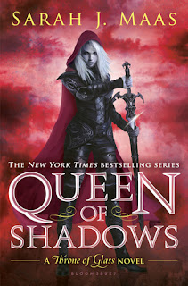
Queen of Shadows (#4 Throne of Glass series) by Sarah J. Maas || Review Friday

Zoe here, and let me warmly welcome today's guest reviewer, the wonderful Isha. We had met on Pentatwine's Instagram through a mutual friend and we hit it off with a  common love for books. She is a huge Throne of Glass fangirl and is eagerly waiting for the fifth book in the series. So, she decided to write this review for all the Sarah J. Maas fans out there who are eagerly waiting for Empire of Storms. After reading this review, I'm convinced the next book is gonna be epic.

So, without further ado, I'm handing it over to her..


Title: Queen of Shadows
Series: Throne of Glass
Author: Sarah J. Maas
Genre: Epic Fantasy

Queen of Shadows is the fourth book in Sarah J. Maas’s awe-inspiring Throne of Glass series. Celaena Sardothien is back. And this time, not as Celaena, but as Aelin Ashryver Galathynius ( I finally learned how to pronounce it). Yes,she has finally embraced her identity as Aelin, the queen of Terassen.

In the previous book, Celaena received training from prince Rowan and finally mastered her powers. And that makes her even more powerful and badass. Word has spread that Aelin, more commonly referred to as the Fire-breathing Bitch Queen, is back.

The encounter between Chaol and Celaena was awesome – don’t accuse me of spoilers, everyone knew that was happening- and Chaol was quite irritating throughout the book. He didn’t trust Celaena at all, and accused her of doing ‘stuff’ – not gonna tell you- that we obviously know Celaena is NOT going to do. And in the end, he basically got into his head to do the very same thing he was preventing Celaena from doing. (Ugh, men , I tell you!). 

And then we are introduced to some very  interesting characters from Celaena’s life before being captured. And some characters from the time before she became an assassin.

SPOILER ALERT
[Spoiler start] 
Close your eyes if you don't want to know. But it is only two words. 

Arrobyn Hamel.

[Spoiler closed]

Manon Blackbeak  was an awesome character. There were times when I loved her even more than Celaena. In the previous book, nobody wanted to read the witch chapters, but I promise you, in this book, you would not be able to wait to get to them.
And Aedion. *internal fangirling*
Somebody has to rescue Aedion, guess who?
And poor Dorian. He needs rescuing from his ‘evil Dorian’ state. To all the celorian shippers out there ( that includes me too) ,you are going to get a shock in the end.
And one more thing, figure it out if you can, there is a very surprising development concerning Rifthold.

The book was amazing and I have never seen so much progress in a single book. The second half of the book was shocking. The book went from ‘barely any progress at all’ to ‘each and every mission accomplished!’
Celaena’s character has developed so much. You can actually see the queen in her. And before the fangirl in me starts to come back and I give you guys some major spoilers, I should wrap the review up.
It is by far, my favourite book in the series. And guys, Empire of Storms is coming out on 6th September, it is SO close, I can’t wait for it!

So read it, and share your thoughts. I know you are going to love it.

Rating: 4.5/5


Zoella: If you would also like to write for us, please click on the guest writing tab above. Looking forward to hearing from you.

Thursday 25 August 2016

Cover Love #12


It's that time of the week again where we are back with our popular feature, Cover Love! This is the most amazing Jordan Carat here, along with the so-so Zoella Rose ready to serve up our thoughts on this weeks entourage of book covers.

Cover Love by Pentatwine


Winter Queen by Amber Argyle | Cover Love
Winter Queen by Amber Argyle

Jordan: While I like the tumultuous hues of blue, I find that this cover somehow lacks the finesse it needs to really stand out. And I really disapprove of the colour of the title font.

Zoella: I love this cover. The colour palette of the wings ranging from violet to white is simply stunning. The little fairies flying around add another layer to the story. The character is caught mid dance, which is not usually seen in covers, and it looks pretty. Bonus points for the flower crown.

P.S: I agree with Jordan about the font colour, it's boring (finally we agree on something).

The wondrous and the Wicked by Page Morgan | Cover Love
The wondrous and the Wicked by Page Morgan

Jordan: This does not seem to be the kind of book that I would voluntarily pick up. I don't like the hazy lines, and the cover looks like a blurry mess to me. (I have got my glasses on, thank you very much!)

Zoella: This is the second or third book of the trilogy and doesn't it look amazing? I saw a picture on instagram of all the book together and it looked so aesthetic. But, when I searched for this cover, I saw other versions of the same, it looked more historical, which confuses me about the genre. Which genre is it actually?

Love Beyond Measure by Bethany Claire | Cover Love
Love Beyond Measure by Bethany Claire

Jordan: While I have waxed eloquent about my love for pastels, I do adore a good autumn themed shade card. However, the transition from the upper scene to the lower scene is quite jarring; and that white title font does nothing to tie it all together. This does miss the mark for me.

Zoella: For me what attracted me to the cover was the different looks of the woman and her reflection. And it is a Scottish time travel romance, so if you are fan of Outlander, then this might be right up your alley.


 The immortal Game by Joannah Miley | Cover Love
The immortal Game by Joannah Miley

Jordan: Wow, are we on a roll here? Another cover that I don't like. While I'm all about simplistic designs, this one rubs me the wrong way. I would pick this up, make a face at it, and then completely steer clear of it. I don't find anything redeeming about this cover. An absolute nay from me.

Zoella: This cover looks so interesting. The girl with the bow standing on a chessboard and a mysterious guy walking into the mist. Intriguing. I also love the font used. I am adding this book to my TBR pile right now.

Ink and Bone by Rachel Caine | Cover Love
Ink and Bone by Rachel Caine

Jordan: First up,the title font is fantastic.I love the dark yet bright imagery. That play with the opposite colours on the colour wheel sure is intriguing. This is a great cover to break my streak of disapproval till now.

Zoella: I absolutely adore this cover. Love the font, the background imagery and the ink dragons. I don't have one bad thing to say about this cover.

The Passionate Queen by Jovee Winters | cover love
The Passionate Queen by Jovee Winters

Jordan: Maybe I spoke too soon. I'm blinded by all the red here, and I'm not a fan of the psychedelic concentric circles they have going in the lower half. But I do appreciate that the cover seems to complement the theme well enough. 

Zoella: This may not be my favourite cover in this series. But, this cover is also pretty good. Just the tagline makes me wanna read this book. I can see hearts and cards flying inside the glass bowl, so I am guessing it has something to do with Queen of Hearts. If you like this sort of covers, you should definitely check out the rest of the series. Each one is better than the last.

Happily Ever all-star by Sosie Frost | cover love
Happily Ever all-star by Sosie Frost

Jordan: Oh, I definitely spoke too soon! This cover is beyond all things salvageable. The stark white and neon colours, and the steroid-pumped guy at the back (very conveniently positioned, might I add); I could go on and on, except that these are all what this cover has. Nay. Enough said.

Zoella: This book is not my genre, but these type of covers do a great job of attracting readers, especially when you are browsing Amazon. Neon colours on monochrome is always a winner. If I rememeber correctly, a similar cover with Neon Pink instead of green was featured here previously, probably by the same author.

Update: It was Beauty and the Blitz

A Thousand Boy Kisses by Tillie Cole | cover love
A Thousand Boy Kisses by Tillie Cole


Jordan: 'Pretty' doesn't cut it. I love this cover. The hazy, out-of-focus flowers in the backdrop, the water drops adding to the whimsical feel, and the origami heart which takes the cake. I adore the colour scheme, and that beautiful finger-drawn jar on that foggy windowpane. 

Zoella: This cover is not my type. I like the foggy windowpane like Jordan, but that's it.

It's so hard to choose a favourite cover (probably because I chose all the covers except last). Winter Queen and Ink and Bone are my favourite.

Jordan: Unsurprisingly, my favourite cover this week is that of Tillie Cole's A Thousand Boy Kisses.  The cover tugged at my heartstrings and I relish in the serenity this cover emanates.


Sunday 21 August 2016

Book Nerd Problems #9


Another week another problem...the book nerds are here! This week's problem is extremely common. 


You gotta admit, fanfics are a god send! Anyone here who read a million prequels and sequels of Harry Potter after Deathly Hallows ended? Anyone who was obsessed with Twilight and went searching for a thousand more Bedward tales? Anyone who searched for Gone with the Wind fanfics and came out disappointed? Tell me all about it...because this was all so me! As well as Inia and Jordan to a smaller extent (*I know for a fact that Inia is currently in love with Captive Prince fanfictions...shhuush don't tell her I know)


Friday 19 August 2016

The Raven Cycle series by Maggie Stiefvater | #reviewfriday

I don't do reviews often, I like to talk about them than actually write it. But, once in awhile, a book comes along that pushes you out of your shell and makes you yell to the whole world "you've got to read this. This series was one such series for me. It comprises of The Raven Boys, The Dream Thieves, Blue Lily Lily Blue and The Raven King. It isn't my favourite series, I probably wouldn't even reread it. But, this book has one specialty which makes me recommend it to everyone.


Series: The Raven Cycle
Author: Maggie Stiefvater
Genre: Fantasy
Age Demography: Y.A

This series was a strong contender in our Cover Love Series. I think we have already featured the third and fourth book. They have such pretty covers. Made me want to buy the books just because of it. Okay, enough babbling about the covers, let's get right on with the review. But, first here is what goodreads says about The Raven Boy's story. 

Every year, Blue Sargent stands next to her clairvoyant mother as the soon-to-be dead walk past. Blue never sees them--until this year, when a boy emerges from the dark and speaks to her.

His name is Gansey, a rich student at Aglionby, the local private school. Blue has a policy of staying away from Aglionby boys. Known as Raven Boys, they can only mean trouble.

But Blue is drawn to Gansey, in a way she can't entirely explain. He is on a quest that has encompassed three other Raven Boys: Adam, the scholarship student who resents the privilege around him; Ronan, the fierce soul whose emotions range from anger to despair; and Noah, the taciturn watcher who notices many things but says very little.

For as long as she can remember, Blue has been warned that she will cause her true love to die. She doesn't believe in true love, and never thought this would be a problem. But as her life becomes caught up in the strange and sinister world of the Raven Boys, she's not so sure anymore.


I read this series after falling in love with her standalone Y.A fantasy The Scorpio Races(it's AMAZING). So, I had high expectations.While, I believe that she has delivered her promise, I am unable to fall in love with the books. It might be because I'm used to kickass Urban Fantasy, and this is comparatively slower. I also don't love the ending very much, although it was packed with drama, it fell a little flat for me. But, I still recommend this series to everyone, you know why?

It's because of the characterization. Stiefvater should be crowned the queen of writing the most life-like characters, she is that good. Even if you may not identify with all the characters, you will still be able to understand them, which I feel is a huge accomplishment. Also, none of the characters felt like they were thee just to enhance the greatness of the lead pair, Gansey and Blue. All of them had their individual aspirations, turmoils, and forbidden dreams. I ended up deeply caring for each one of them, even Noah I love it when a fantasy novel makes you believe it is true, simply because you want the characters of the novel to really exist. Stiefvater has done exactly that.

Her writing is beautiful, she manages to capture entire descriptions in a single sentence, painting the scene so vividly that it remains etched in our mind. Kudos for that.

One thing I respect about both Maggie Stiefvater and David Leviathan is that they don't classify people according to their sexuality. They just write it as if it's no big deal, which is exactly how it should be. Anyone read Everyday by David Leviathan? You should.

A complaint I have about this book is that, although it's a page turner, the pace is slow. I am a bit prejudiced here because most of the novels develop at breakneck speed. So, comparatively speaking, this one had good speed, but it's not fast enough for me.

Rating: 4/5

Which book are you reading now? I am in a reading slump currently, got any recommendations for me. I am a Ilona Andrews and Six of crows fan. Anyone here waiting for the second book of Hidden Legacy or Crooked Kingdom.


Thursday 18 August 2016

Cover Love #11

Hello folks! Another week gone by...how is August treating you? This is Hira here and since the two knuckleheads who are doing this week's commentary are too lazy to come up with an intro (*can't blame them..they are drained writing the huge essays under each cover),  here I am doing the very important and in fact, the most important task of welcoming you to Cover Love #11


So let us start!


Matched Trilogy by Ally Condie | Cover Love
Matched Trilogy by Ally Condie

Zoella: Yes, I know, I was supposed to pick just one book, not an entire trilogy. But, how can you say no to these amazing covers. These have definitely been influential in getting me into the world of cover designing. The covers are simple, elegant and powerful and when placed side by side unfolds the whole theme in front of you. And the font is so unique and amazing. Love it.

Inia: Love love love love love. I love it!! Everything about these covers is absolutely brilliant. The colour transition from a mellow green to the fiery red seems so symbolic to the theme the pictures on the cover portray. Like, I would guess the meek, trapped girl on the cover has metamorphosed to a free, confident woman by the end of the trilogy. The font goes perfectly with the simplistic elegance the cover art exudes. These are definitely some of the best covers I have seen in a while!
   
Delirium by Lauren Oliver | Cover Love
Delirium by Lauren Oliver

Zoella: This is the revamped version of the bestselling Delirium trilogy. I don't know about you, but this is so much more unique and better looking than the previous cover. Like the Matched trilogy, this also have a main focal point which is the heart made of stone. I haven't read the book yet, but from the blurb, I believe that this one represents the story better. (Roughly saying, it's about a dystopian society where love is considered dangerous and is prohibited)

But, the main problem is that it's hard to identify the genre or what age demographic the story is for in one glance. But, since this book is already a bestseller, it's relatively safe from being affected that much.

Inia: Objectively it's a pretty cover. But it doesn't stand out to me. Great colour scheme though. I like the aqua blue background. It complements that heart on the cover and makes it pop. Yellow for the font is a nice touch too.

Rebel of the Sands by Alwyn Hamilton | Cover Love
Rebel of the Sands by Alwyn Hamilton
Zoella: If the title hadn't clued you in, on what the story is going about, then the cover surely will. It's about a rebel (a teenager) in the desert. Yep, that's a bad explanation, I know. First of all, I love the border designs, I don't what they represent, but I have this nagging feeling that they mean something. What do you think it is?

Apart from the beautiful border, we have a starry night sky, a palace, sand dunes, we also have a  rebel riding a horse. I am in love with all the details. Another detail you might have missed is the diamond shaped design which stand sentinel on the author's name. Just seeing this cover makes me so happy.

Inia: I like the font of the title and the picture inside the border. But the border design.... it is too overwhelming. It takes up most of the cover of the book and the huge font takes up the rest. I feel like they should have managed the space more judiciously. Judging by the cover, I would think it was an Arabian Nights type of thing but Zoe says it is about a rebel in the desert. What does that mean? I mean, why would you rebel in the desert of all places? Who's gonna see you? Camels? Sorry, I will get back to criticizing the cover now. I like the blue and gold colour combination on the border even though I don't like the border. It's an ok enough cover, I guess.

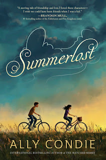
Summer Lost by Ally Condie | Cover Love
Summer Lost by Ally Condie
Zoella: Kiersten White and Ally Condie are two extremely lucky authors, in terms of the book covers they've got. I want to buy all their books, just for their covers, they are that gorgeous.

Disclaimer: I don't know if it's Summer Lost or Summerlost. So, for this post's sake, I'm going to refer to the book as Summerlost

First of all the typography, the way the title is treated is pretty spectacular. It gives a feeling of gentleness, of gliding clouds and summer breeze. It was the first thing I noticed about the book. 
The second thing were the two kids, which screams that this book is Middle Grade Fiction. I may never read the book, but the temptation is strong.

The cover promises me happy times, sorrow, heartbreak, friendship and contentment. So, if there are any lovers of Middle Grade here, then please try this book. I have read her Matched Trilogy and judging from that, I think this book will deliver on its promise.

Inia: This cover is evoking nostalgic feelings in me and I don't even know what I'm being nostalgic about. Childhood maybe. I love the cover but it is making me melancholic. It is tugging at my heartstrings probably because I'm getting some vibes from the cover telling me this book is going to be an angsty ride. Summerlost. Definitely sounds angsty. Hira would probably love to cry to death over this book. The cover art is all breezy and serene... too calm.. and that is exactly why I do not trust this book. It looks like something you would pick up thinking "awww look at the cute cover! this is perfect for a light read!" and the next thing you know your eyes are blotched red and snot is running down your nose. Nuh-uh. I'm not taking my chances with this.


Inia: Boring cover. Typical bestseller type cover art. I reaaally don't like it when the author's name and the title takes up the whole of the cover, especially when the font is so basic and unattractive.

Zoella: When I first saw the hardcover of this book(on Instagram), for a moment I thought the book was actually underwater. So, the cover scores a perfect ten on the reality scale, but I don't know how well it represents the genre. But, that said, I love the clean font and the colour gradient used. And the title is pretty self explanatory. Gah, who cares about the genre rules, I love this cover.


 Inia: A beautiful funeral? Good God! Hira selected this, didn't she? She's a dark soul. Beautiful cover though. Specks of colour in an otherwise grey, foreboding background. Goes perfectly with the title; beauty against a dark backdrop. 

Zoella: The background picture is very common and cliche, but the autumn leaves add a dash of colour and vibrancy to the cover. So, thumbs up for that.


Inia: The girl looks a cross between a Wildling and a White Walker (Whaddup Game of Thrones reference!)  Is this a fantasy novel, Zoe? I'm guessing it is. No wonder I don't find it appealing. Also it has such a dull and cold colour palate. I'm feeling chilly just looking at the cover brrr.

Zoella: This book is so my type. I have a soft corner for bluish hues and this one is right up my alley. The story seems to take place in some exotic location. Hmmm, I might try this book. Have you read this book? Would you recommend it.


Inia: Aww I love this! This is the kind of romance novel covers I like. Something which shows an actual relationship with all the cutesy stuff and not the usual 'Imma throw you into this waterfall and ravish you' kind of covers with half naked people all over it. I would read this even though I don't like romance novels(especially not heterosexual ones) just because it looks like it tells the story of a meaningful relationship.

Zoella: Bleh, the cover is too bland for my taste. Hira might like this though.

My favourite covers this week is Matched Trilogy and Delirium.

Inia: My favourite covers of this week are the Matched Trilogy ones.


Hira: Wow...lots of Hira references huh?  Inia, I don't think Summerlost is angsty enough for me...from the look of the cover it seems like the bleh kind of angst.
Beautiful funeral- the irony right? It was the name which attracted me...but also the background, like a cemetery in autumn. (Yes, Inia is right...my soul is dark.)
Artfully Yours- definitely my type of cutsey romance...Jordan may like it too.

So that's it for this week's cover love...go check out these books kids!


Saturday 13 August 2016

Book Nerd Problems #8

Hello homies....how's your weekend going? Well Zoe, Inia, Jordan and I just had a girls night out
and it was so much fun! Icecreams, pizzas, laughter, and a million funny pics. 

As usual when four books nerds hang out the topic obviously will be books! We were talking about those pretensious bibliophiles who buy books to showcase rather than read and somehow we reached till here!


A pretty common question, huh? But still one which manage to annoy the crap out of you, I bet.Tell us if anyone has said these words to you? How did you react?


Friday 12 August 2016

The Curse of the Cursed Child | #reviewfriday | Harry Potter and the Cursed Child review

It's been nearly ten years since that summer in 2007 when I waited for the release of Harry Potter and the Deathly Hallows. It was the the saddest and happiest day of my life when I held the hardbound book in my hands.

I thought it was the end and prayed fervently for Rowling to change her mind to write something, anything more about the beautiful magical world she had made. And then Harry Potter and the Cursed Child was released, and now I wish Deathly Hallows had really been the end.

Disappointment is too mild a word for describing the script of Cursed Child. I find it extremely difficult to believe that Rowling is associated with this work. I am sorry to say this, but I have read much better written fan fictions than what is now being called as the 8th book of the Harry Potter franchise.


Title: Harry Potter and the Cursed Child
Author: J.K Rowling, Jack Throne, John Tiffany
Genre: Fantasy


*BEWARE SPOILERS AHEAD*

It was not just one thing which made this book a disaster. From the very beginning a lot of things seemed to be out of character. Hermione Granger is certainly a very good diplomat but the whole idea of her as the Minister of Magic is too much of a fanfic cliche. She appears to be the only strong female in the story. The fact that the book reduced the fiery Ginny Potter to nothing more than a wife was very upsetting. Ron is another character whose importance was stripped away; one of the most important character's in the original book, he has now become mere comic relief.

Also the number of plot holes in the story are overwhelming. Albus gets sorted into Slytherin and Harry is not okay with it, a 180 degree turn from what he had promised. You have to remember that this is the same Harry who named his son after a Slytherin he had despised for most of his teenage years.

And the whole plot line of Voldemort's daughter; I still find it difficult to believe that it is actually a real thing. Like Voldemort did the deed with Bellatrix. (*Really? Couldn't hefind anyone less crazy?*)
As difficult as it is to imagine Voldemort as a father, it's even more difficult to fathom Bellatrix as a mother. Also when exactly did this said pregnancy happen? The book says it was during the time they stayed at the Malfoy Manor, but then how come Bellatrix was running around at the Great War?? (Or is the pregnancy duration different in the magical world?) Anyway, it's too unrealistic.

Also, don't get me started on the time-turners and the alternate worlds they created because it is too much to process. I just want to take a moment to congratulate the people behind this work for putting so much effort into the script and working so hard that they didn't get time to do a simple Google search to find if "Panju" was an actual Indian name.

I wish racial ignorance was the only thing the writers were guilty of. But no, the book kept building up the readers for a Albus-Scorpius romance only to shatter everything with a Scorpius-Rose plot line at last. For a moment, I had felt this was going to be a path-breaker, a story which proudly showed that love came in all shapes and sizes. But nah, that wouldn't sell many copies, I guess.

Overall, the only thing I can truly say I liked about the book is Scorpius Malfoy. He was everything I'd imagined and more. But I hate that they continued to give Draco a negative shade, even though Harry and Draco had patched up their issues in the epilogue of Deathly Hallows. But who cares, right?

Rating: 1/5 (The one is just for Scorpius #cameforalbus #stayedforscorpious)


Thursday 11 August 2016

Cover Love #10

Hello! It's Hira here! I know you missed me last week...Jordan and Inia can never reach my level of awesomeness right? 
Cover Love #10...already? It feels like it was only last week when Zoe came to me with this crazy idea.

Cover Love by Pentatwine #week11


So lets make a move and get started on this week's covers!

Harry Potter and the Cursed Child by J.K Rowling | Cover Love
Harry Potter and the Cursed Child by J.K Rowling
Jordan: The shiny gold makes it look like an Easter egg. I am not a fan of the wings; they look very sketchy and out of place, like it's a last minute addition. Overall, I don't find the cover very 
impressive.

Hira: It's a snitch! I am disappointed in myself...I can't believe it took me so long to get the connection. I have to admit I was not very impressed by the cover when it was first revealed, mainly because it looked nothing like the other Harry Potter covers, but then I heard Zoe praising the cover and took a proper look at it. The details of the nest and the black wings are pretty good. Also the golden color is quite beautiful too. But overall I don't find it very attractive (maybe because of how disappointing I found the book to be.)

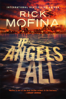
If Angels Fall by Rick Mofina | Cover Love
If Angels Fall by Rick Mofina

Jordan: The scattering of clouds across the reddish orange sky and the contrasting blue waves beneath make it a very eye-catching cover. I love the way even the font seems as thought it's immersed in waves. The receding backdrop of the city make it seem as though you are moving away from it.

Hira: This is my type of cover.The waves and the title written across it is quite catchy. The reddish-blue sky and the city lights in the distance...I love this cover.

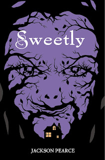
Sweetly by Jackson Pierce | Cover Love
Sweetly by Jackson Pierce

Jordan: It looks creepy. So creepy, that I won't pick it up. The way the branches curve around to form a person's face is quite ingenious and the white swirly font of the title and the title itself make the cover seem ironic.

Hira: I don't what to talk about this cover because it disturbs me a lot. This is a book I will ever read.

Thorn by Intisar Khanani | Cover Love
Thorn by Intisar Khanani

Jordan: I don't gravitate towards fantasy books. Since, it clearly seems like one, I don't like it. I don't like the way the colours meld into each other and the other elements in the cover seems tacky.

Hira: I thought this was a historical romance cover, to be honest. But whatever. I like the title and it's font. The palette is just a bit too bright for me. And I usually tend to stay away from covers with a lot of gardens, flowers and shit.

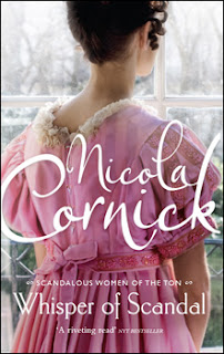
Whisper of Scandal by Nicola Cornick | Cover Love
Whisper of Scandal by Nicola Cornick

Jordan: Pastel colours and white fonts give me life. The woods outside seen through the frosty windows, the blush coloured dress and the demure pose the woman embodies-are all details that make you appreciate it even more, after you've stared at it for hours.

Hira: Nope. Not my cover again. It seems too off somehow. I did like the font but otherwise not a cover which I would give a second glance.

It Ends with Us by Colleen Hoover | Cover Love
It Ends with Us by Colleen Hoover

Jordan: I would grab this just for the cover. The pale hardwood floor makes a beautiful backdrop for the destroyed flower. The dark hints of lilac-ish red seems like splattered blood, and the green of the stalk highlights the main colour.

Hira: I think it's evident by now that Jordy's and my taste in covers are polar opposites. I did like the scattered petals and the overall palette but I don't like the font or the design.

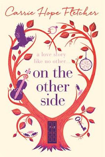
On the Other Side by Carrie Hope Fletcher | Cover Love
On the Other Side by Carrie Hope Fletcher

Jordan: I see a bird, a key, a dream catcher, a ring, a guitar, and some candy. The tree curving into a heart and the door in the tree trunk gives it a whimsical feel. I also find the color scheme quite interesting. 

Hira: I feel this is a over-used style which is done to give the appearance of uniqueness. The violet and red combo works well...but the tagline is barely visible. Again not really my style.

Sweet Tomorrows by Debbie Macomber | Cover Love
Sweet Tomorrows by Debbie Macomber

Jordan: I would love to go on a weekend trip to this place and curl up till next Monday. The fairy lights, the hammock with the comfy blankets and the throw cushions,,,, aah, bliss. I adore the cover.


Hira: Okay, this one I like. It gives of the vibe of summer and solitude. The scenery, the lights and all those cushions...I might be in love. The  palette is very very beautiful.


Hira: I loved Sweet Tomorrows and If Angels Fall. I think I like the later a bit more since it's a first time that a cover of that type is shown here.

Jordan: And my favourite is Sweet tomorrows.For once we are agreeing Hira!


Saturday 6 August 2016

Book Nerd Problems #7

Zoella: This is something, I am sure, you as well as both Jordan and Hira (my co-bloggers) can relate with.

Book nerd problems week 7


Zoella: Which was the sequel that burnt you bad?

Hira: Okay so I JUST had to butt in here and give my two cents of opinion on this topic. Harry Potter is a symbol of my whole childhood. My parents used to read the first few parts to me when I was too young and later the book brought me close to all my closest friends. And now the sequel has just absolutely ruined it all for me. At first I had been in denial and refused to accept that the Queen would actually be a part of such a mediocre work (Come on! I have read fan fictions which had much better plot lines), but now I am just really angry and frustrated. To the quote above, my thoughts  exactly!

Jordan: Oh I've been burnt and scarred by Jojo Moyes's After You. While Me Before You touched my soul to the very core, its sequel made me cringe and throw it out even before I got to the halfway mark. The experience was excruciating, and it ruined the emotional attachment I had towards the characters in Me Before You. Bumblebee tights , my foot!

Friday 5 August 2016

THE SONG OF ACHILLES BY MADELINE MILLER || #reviewfriday

 I’m not usually a big fan of mythological fiction but I thank every one of the Greek and non-Greek gods that I decided to give this one a try. The Song of Achilles is one of the few novels that managed to shake me to the core and affect me in a way that I can’t even describe. All I can say is, I cried me a river reading it. It was simultaneously heart-warming and heart-breaking. And it was a book that stayed with me long after I read it.


Title: Song Of Achilles
Author: Madeline Miller
Genre: Mythological fiction
Trigger Warnings: Rape, Violence


TSOA is a retelling of a small, insignificant part of Homer’s The Iliad. For those who don’t know what Iliad is, it is a Greek epic poem about the Trojan War (between the Greeks and the Trojans). Achilles, the Greek warrior, was one of the war-heroes in the Trojan War and one of the most important characters of The Iliad. Miller adapts the story of Achilles and retells it from the point of view of Patroclus, his best friend. She re-imagines their friendship as a romance between the two and succeeds in creating an absolutely brilliant love story.

                       Miller mostly stays true to the original Greek legend and the chronology of the incidents leading to the Trojan war is unaffected. The only artistic license she takes is in exploring the intimacy of the relationship between Greece’s greatest warrior and his best friend. TSOA begins with the young prince Patroclus being exiled to the kingdom of Myrimdons to be raised there. It is there that he meets Achilles, the son of Peleus, king of Myrimdons and the nymph goddess Thetis. The arrogant and perfect Achilles and the underdog Patroclus develops an unlikely friendship. They soon grow close and their friendship blooms into something more. Their love was not easy though. Amid war and vengeful opposition from Thetis, they always had a cloud of inevitable doom hanging over their love for each other. They knew it would never be a happily ever after for them even though that was all they ever wanted.
      
          The love story of Achilles and Patroclus is raw and devastating. Even with a little bit of knowledge about Greek mythology, the reader would know that a story with Achilles will be a tragedy. I have read The Iliad but never had any emotional attachment towards Achilles. But Miller transforms both Achilles and Patroclus to characters we can’t help but root for, even with all their shortcomings. Patroclus is endearing in his earnestness to overcome his fragilities and we sympathise with him as he survives in a culture that respects only heroes and Gods and he is neither.   Achilles, for all his vanity and arrogance, is a brave and righteous man and his intense love for Patroclus makes us wish that they would get the happy ending that they have always dreamed of.
          
            Madeline Miller spins an incredible tale of an unlikely romance in an extremely believable way in TSOA and keeps the reader hooked from the first line to the very last. Her writing is crisp, her plotlines are brilliantly constructed and perfectly executed and most importantly her facts and situations run parallel to the original tale making the adaptation an entirely conceivable one. I suggest everyone give this a try even if mythological fiction is not your thing. You definitely won’t regret it.

Rating: 4.5/5


Thursday 4 August 2016

Cover Love #9

Out with the old, in with the new! We've chucked Zoella and Hira out of the window and we've claimed the fort, well, at least for this week.  Inia and I are certainly rookies at this job, but we're definitely awesome at being critical while we judge these books by their covers. 


This week's covers were chosen by Hira, Zoella and Inia. Jordan just pitches in with her comments on each one.

The Chaos of Stars by Kiersten White | Cover Love
The Chaos of Stars by Kiersten White


Inia: I love the colour combination of this. The midnight blue and gold gives it such a mysterious and magical look; it reminds me of a wizard's cloak.  The swirly font goes perfectly with the mystical theme that seems to be dominating the cover. This is the kind of book that I would place on the front on my bookshelf for the aesthetics but would keep postponing reading because looking at the cover and the tagline, this seems like a fantasy novel and I don't do fantasy. 

Jordan: I would love to have  a hard cover edition of this book. The gold against the varying concentrations of dark blue with the hints of silver have swept me off my feet. The way the title and the byline connect with the corner applique of vines and flowers makes it come alive. I would definitely get this book, if only to display it in my archaic bookcase.

Project Cain by Geoffrey Girard | Cover Love
Project Cain by Geoffrey Girard


Inia: Ok, this looks pretty interesting to me. I have no idea what the book is about but it looks like a psychological thriller, going off on what this segment is all about; judging the book by its cover. The guy is looking at his reflection in a puddle of water and sees himself holding a dagger in it; looks pretty psychological thriller-ish. Or, considering the fact that Zoe selected this cover, it's probably a fantasy novel in disguise. Makes sense what with the title being in a spooky font and having the name Cain highlighted. 

Jordan: Dark, murky forests, a seemingly shallow pool of water, that reflection (which for some reason, seems off), an eery moonlit night; what more do you want to set the ambiance for intrigue and danger. The font isn't my favourite aspect about this cover, but it doesn't make me cringe either.

And I Darken by Kiersten white | Cover Love
And I Darken by Kiersten white
Inia: At first glance I thought this was a dagger going through a rose and died because the dagger-rose symbolism means a lot to me (it's a fangirl thing and related to my OTP). On a closer look though, it looks like a spear penetrating a random flower (jeez the innuendos in that!!). I guess, objectively, the cover is pretty but it looks boring to me. And very fantasy novel-esque.

Jordan: I did a double take here, and then I magnified the cover to take in all its glory. This is gorgeous! The lavender and lilac petals look beautiful against the shimmer cloud and the dark backdrop. The glimmering spear piercing through flower, and the way the font is positioned is quite strategic. The attention to detail is noteworthy, what with the shaft engraved to look like a reptile-like creature. I'll definitely pick this book up for the cover.


First Life by Gena  Showalter | Cover Love
First Life by Gena  Showalter


Inia:The tagline and the cover art makes me think this is a dystopian fiction type thing. Looks very depressing. The colour palette is very suffocating to me: this mix of dull sky blue and greyish violet. And somehow the shadows and contrasts make it ever more stifling. The hourglass looks pretty omnious as well. I wouldn't go 10 feet near this book if the inferences I made assessing the cover are true. 

Jordan: This cover design is ingenious and awe-inspiring. That being said, I find the concept of the book confusing. Does this mean that the dreary world will turn into a bright one when the fast-ticking time runs out? And like Inia said, this seems to be exactly the kind of book that we won't pick up.

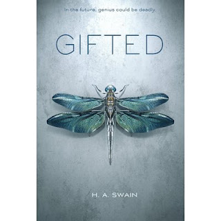
Gifted by H.A Swain | Cover Love
Gifted by H.A Swain


Inia: The cover looks ok enough. A bit too simple though. And too much grey.

Jordan: It is a pretty cover, but not something worth picking up.


Unbreak me by Julieanne  Lynch | Cover Love
Unbreak me by Julieanne  Lynch


Inia: Oh this is so pretty! I love the contrast between the intricate cover design and the simple font. The turquoise and gold butterfly against the midnight blue and blue-black background is brilliant. The tagline is so cringey though; it gets an eye roll from me.

Jordan: Inia might be crazy about this cover, but I'll pass this up. It looks gaudy to me. It might redeem its worth as a hard bound edition, but for now, no. 


Inia: This is such a cliche romance novel cover, I hate it! I can make better covers than this and I don't even know how to use basic Photoshop. Also what the hell is that font?! Did they put any effort into this cover at all? The writings on the cover are cluttered and too big. That emerald-black colour combination with that picture is pathetic. Am I being too hard on this cover? Good. Because it is not impressive at all.

Jordan: Inia checks all the boxes on the list of what went wrong with this cover. I wouldn't take a second look at this

.


Inia: This is a really elegant cover. I like it. Great colour palette and cover art. It goes perfectly with the meaning inferred from the title. The font is simple and classy just like the rest of the cover. I love how the author's name is given in a modest size font and not taking up half the page as some of the other covers I saw in this #coverlove session.

Jordan: The ripple effect makes the underwater scene a very tangible one. The shimmer cloud makes it seem as though she is disintegrating in the water. This cover piques my interest, and I would like to find out how the female on the cover is related to Poseidon.


Inia: I think my favourite from this week's covers is 'The Chaos of Stars' (the cover I selected myself).

Jordan:  And mine has been the cover of And I Darken 

And that is a wrap. Today's Cover love saw a few hits and misses, but being judgmental (about covers, mind you) was quite fun.