
And we are back again...This is the fourth week of Cover Love. A month old already. Wow! So in celebration of turning a month old this week's cover love is specially themed. All the covers below are in beautiful hues of blue.

(Also like last week...both Zoella and I will be giving our opinions on each cover)
So what are you waiting for..dig in!

Hira: Interesting. That's the first word that comes to my mind about this cover. In some ways the image reflects the name of the novel. The stories where messages were sealed in bottles and thrown into the sea hoping it would reach the dead...the picture oddly brings those stories back to my mind. The bluish white palate is so beautiful yet it gives out signs of gloom. And notice the details like the waves hitting the city shores. Also the overall 3D effect the bottle gives out is just so good.
Zoella: This cover is unique. I love how the reflection of the city shows a spooky ship travelling through treacherous mists. And like Hira said about the waves under the city- the attention to detail is applause worthy.I am not a big fan of the typography; it gets cut off at the ends, which I don't like. But that is just my opinion.

Hira: Very intriguing. The name is The Raven King but oddly the cover focuses on a stag. The stag is painted in a wonderful blend of black and blue which is difficult to take your eyes off. It's the color of copper crystals and is one of my favorite shades of blue. For this reason alone I love the cover. Also check out the black ravens on the side...a stark contrast against the white. The artist who made this cover is obviously very very clever.
Zoella: I love love love this cover. The texture, the color, the details everything. It's a brilliant piece of work. See how the fabric like texture swirls to form an eye. The gradient in the ear, colors going from dark to light just like real ears (even though real ears are not blue). It's a beautiful cover and an even more beautiful story. Highly recommended.
Warning. This is not a standalone, it's a fantasy series.

Hira: A mysterious blend of blue and red, with a font which is all lines and curves. The dragon on the top and the smoke like swirls of white in between add to the mystique element . But I don't find this cover that striking mainly because I dislike this shade of blue as well the combination of blue and red.
Zoella: This is not my favorite cover of the series, but I like it. I always love it when the title interacts with the rest of the cover. Like in this case, where it curves around the castle and whatever it is that is behind it.. Love the addition of dragon, but I wish it was part of the title, like it billows up from the letter e maybe. But nevertheless, it's a good cover.

Hira: It certainly is a gorgeous cover. But somehow it feels as though I have seen it before. I cannot find anything unique about the cover. Despite this I love the background image of the sun breaking though the clouds.
Zoella: The Orphan Queen; love the title. For me, the main attraction was the typography, while it is not very unique, that along with the main image just drew me in. This cover promises me political drama and magic and possibly a strong heroine. It's the kind of book I wanna read.

Hira: The blue that is the color of sky with navy colored font. The woman tangled in a web of roots...that seems very deep (*bad pun*). Or is the web protecting her from a free fall? The cover certainly pokes around inside your head, asking questions which make you want to pick the book up and search for the answers. Again, a very clever design.
Zoella: I agree, it's a clever design. It makes you ask questions, doesn't it? It's interesting how the tree branches seem to be helping the woman and trapping her at the same time. Is it a woman? I think it is. Can't be sure though. But the main attraction of the cover is the review quote, from the king himself. That should have been made bigger. The cover is intriguing and tempting enough for me buy it. My TBR pile just keeps growing *sigh*.

Hira: I don't know why but it brings to my mind the imagery of Mid Summer Night's Dream. The whole cover gives off a magical vibe. And with the full moon in the back..magic, love, miracles...they all seem like possibilities. The little lights on the branches are really beautiful and add to the feel. But again, even this cover does not feel remarkably unique to me.
Zoella: This cover is not unique. The design has been done to death. But it still has that evergreen appeal. Because it's a beautiful, magical and romantic cover and the color palette used is a personal favorite of mine, so I'm biased.

Hira: If this does not look like the film poster of a raunchy rom-com, I don't know what does!. I love the blend of colors. The bluish-white with the reddish-yellow...the meeting of day and night? A dusk or dawn? Or is the blue the sky and the red the hell (or earth)? Also the man and woman at the bottom...so definitely a love story. I also love how the big title is fitted into the whole thing to give off a magnificent air.Very very interesting cover.
Zoella: I adore the color palette. Such rich contrast. The dark hue of the buildings saves it from blending too much into the background. Beautiful typography. The cover is certainly loud, but it is loud in a way you love. Like an annoying little sibling. I have wished, I could tape my brother's mouth shut. But, if someone asks who is my favorite person in the world. I only have one answer. My brother.
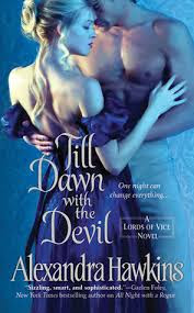
Hira: The only book I have read in this lot. All the book by Hawkins have covers which concentrate on one color. It's obviously a regency romance. And I vouch it's a good one. I personally loved the font a lot. But I have seen prettier covers from Hawkins. So, not one of my favorites.
Zoella: I am not a big fan of Historical Romance covers, because it's too straightforward for me. I love the drama of colors, eye-catching typographies and layers and layers of details. All of which I find in Fantasy covers but not in regency romances. So, this cover while certainly beautiful on comparison with its contemporaries. It does nothing for me. This is one of those, it's not you, it's me situation.
So Zoe (*hey, that rhymes*) which is your favorite from this week? I personally loved the Passenger and Even if the Sky Falls a lot. And I am guessing you loved them too.
Ooooh, good selection. Mine were Passenger, The Raven King and 13 minutes. So those were our favorites. Which ones were yours?

No comments:
Post a Comment
Let us know what you think.