Hello folks! Did you miss us last week? We are terribly sorry for the small hiatus but we had no other choice. Jordan was seriously sick (send her good vibes, she has been miserable), Inia was running rampant with her exams and work was kicking mine and Zoe's arses. I still can't believe we all survived last week. Personally, I would say all credit to coffee...it saved me from permanent lunacy.
Anyway, we are back and hopefully there will be no more hiatuses anywhere in the near future. And guess what, this week's cover love is special!
IT IS THE INTERNATIONAL COVER WEEK!
Basically, we are going to have covers of books of international authors. Usually the large majority of our book covers are from US Publishers so we decided to switch things up a little bit. And I am so proud to be master brain behind this brilliant idea (I am modest like that). I hope you guys enjoy!
 |
| The Immortals of Meluha by Amish Tripathi |
India
Hira: I should start by saying what a huge success this book was. You think Greek mythology is cool? Wait till you have dabbled into the Indian stories. I seriously became addicted to this stuff after reading this book.
Okay, I should talk about the book cover here. Maybe I will do a book review of this one and fan girl there...tell me if you guys want it.
So, the whole reason I picked the book was the cover. It looked like a fantasy cover but there was something really edgy about this one. The colour palate for one was very very intriguing. The man with the dreadlocks and numerous scars, the deadly looking trident right behind his spine, the inscriptions at the top...I was captivated by this cover. And let me tell you, this was a book I finished in one go. You just can't put it down.
Zoella: I have nothing much to add to what Hira has said. I like how all the individual elements come together and how everything is centred. This is the kind of cover that captures your attention even in an aisle of overflowing books.
 |
| The teleportation Accident by Ned Beauman |
UK
Hira: Very innovative, isn't it. The cover looks like loose sheets. I loved this one at first glance but for some reason it feels weird after staring at it for a few seconds. Also it's a bit difficult to read the title. I love over all colour usage, the red, the black, the yellow. It's a nice cover which makes my eyes wobbly after a few seconds.
Zoella: Oooh I love the 3-D effect of this cover. The cover looks very classy. Even the font is getting cut by the panels of red. This cover has a lot going on and even though this looks like a book I won't pick up, I am a sucker for this cover.
 |
| L.I.E.B.E hoch drei by Vanessa Mansini |
GERMAN
Hira: This is not a Hira-ish cover but I feel this is really a Jordan-ish cover. Seriously she might love it. I won't be surprised if it was she who picked this one. The cover idea is cute I guess, but I have never been a fan of Barbie pink. I like how authentic the chalk marks look.
Zoella: I don't think Jordan will like it. She tends to gravitate towards pastel colours. I picked the cover because the cover managed to use a colour stereotyped as feminine and girly into something edgy without losing sexiness. Is Roman ( the name in one of the columns) the hero or something?
I don't like that because it's just written normally while the other graphics looks like it has been drawn with chalk.
 |
| The Twisted Citadel by Sara Douglass |
AUSTRALIAN
Hira: Now this is a Zoella Rose cover if there was one. You love this, don't you Zoe? I personally am very curious about the bubble head like things at the bottom of the cover. It's not rocks...is it helmets? I like the colour palate and the font, but it's too fantasy-ish (I am using a lot of -ish today)
Zoella: LOL. There is so much action going on in the cover, the fairy, the huntsman, the mystic riders. This one looks like an fantasy of epic size. And yes, those are helmets. But one thing I hate about the over is the title font. It's too congested. There should've been more space between the letters.
 |
| All that remains by Lauren Dane |
US
Hira: This one I love. The font, the colour palate, the girl, everything. Also love the tagline...(my inner romantic swoons) The designs at the bottom are a bit out of place but it doesn't bother me much.
Zoella: This is a really cool cover and I like those two little flourishes on the bottom. I'm not sure whether it's contemporary because the series name suggests otherwise. But, all in all this is a pretty eye-catching cover.
 |
| Unwanted by Kristina Ohlsson |
SWEDEN
Hira: Very dark. That's the phrase for this cover and I love it! I have this explainable draw towards creepy, sad books and this feeds my inner masochist. I want to read this. I want to at least check out the blurb. See the blood inside the shoe? I want to know what this book is all about!
Zoella: Add it to your TBR list Hira because I have a feeling you might like this one. For me the most intriguing part about this cover is the white light around the shoe. to me it looks like a puppy. I'm not sure whether it was intended or not, but I like how it adds another layer of smbolism to th cover. And the bllod on the shoes is the right touch to guide the reader as to what genre this is.
 |
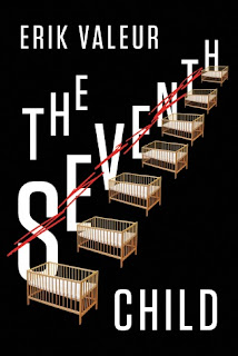
| The Seventh Child by Erik Vallor |
DENMARK
Hira: Interesting name and cover. The cradles with each alphabet corresponding to it, very innovative. It intrigues me...which means its a good cover in my eyes. But I am not a fan of the overall style of the cover. It's eye catching but somehow not in a good way.
Zoella: I love solving puzzles and this cover makes me want to solve it. Since, I concentrate mainly fantasy I don't come across many covers that play with the title like this. It's a refresshing change. This looks like a dark and intriging story. I m going to read this.
 |
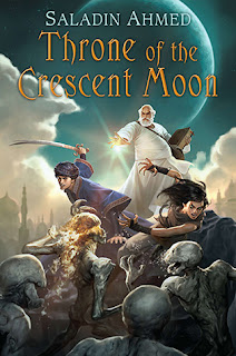
| Throne of the crescent moon by Saladin Ahmed |
Author is Arab-American
Hira: It's a childish cover and I have never been into illustrations. So I am not gonna say much here, since I can't find anything to say.
Zoella: I love this cover. Everything from the font, colours, the burning skeleton, the crescent moon to the fog hidden palaces. This one looks epic.I love the long haired guy, he looks crazy scary. I'm fangirling over this cover so much now. But, one thing I would wih to change is the old wizard because he is the current focal point of the cover. I want it to the fighters. But, other than that no complaints
Hira: My favorites this week have to be The Immortals of Meluha and Unwanted.
Zoella: For me, it's hands down Throne of the Crescent Moon.
Which one was your fav cover. Coment below. And has anyone read Magic Binds or Crooked Kingdom yet? I'm going to start on Crooked Kingdom after I finish fangirling over how good Magic Binds was.


No comments:
Post a Comment
Let us know what you think.