We're back with the best feature of the week,
Cover Love! And this week, all of us have pitched in with the featured covers, which is why you might note a world of differences in the covers. Finding these covers was great fun, and critiquing them was even better.So join me, Zoella, as I get this show on the road!
|
 |
| The Hunger Games by Suzanne Collins |
Zoella: I love this cover much more than its predecessor. This cover is much more fiery (forgive the bad pun). It's like they took the earlier covers and gave a badass twist to it. The designer in me approves.
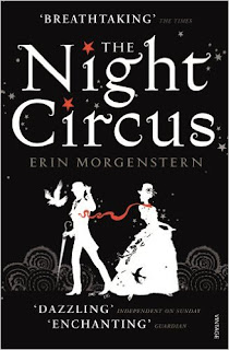 |
| The Night Circus by Erina Morgenstern |
Zoella: I love this sort of covers. And by this, I mean covers which look simple at first glance but reveals layers and layers of details upon inspection. The simple colour palette, the intriguing title, the details of the scarf and the bird on the woman. This is the kind of book that would make me by its hardcover, even if I am broke.
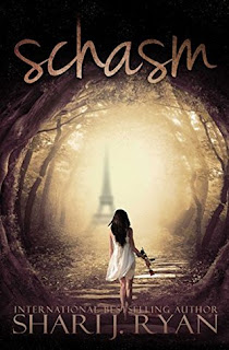 |
| Schasm by Shari J. Ryan |
Zoella: I am confused about this cover. I know it's set in Paris and is not a kickass fantasy, but other than that I'm lost. Is it a portal mystery and what is she holding in her hand? A rose? A violin? or is it some kind of dagger?
Those aside, I love the treatment of the title, the textures and the colours used inside it. Although it does not look like a book I want to read, the cover is certainly eye-catching.
 |
| Lola Rose by Jacqueline Wilson |
Zoella: I own the hardcover of the book. And the sole reason why I bought it was because it was a hardcover. I love hardcovers and when this came up in a sale, I couldn't resist. Cover wise, I am not a big fan. It's just not my type. But I have read
My Sister Jodi by the same author and I had loved it. So, I have high hopes for this book.
 |
| Acid by Emma Pass |
Zoella: I love this cover. Everything from the attitude of the girl, the tagline, the monochrome+red colour palette to the destruction in the background. Well, everything except the font treatment. It's a very bleh colour and font for such an amazing cover. I know the purpose of it is to divert maximum attention to the cover, but it is too bland. What do you think?
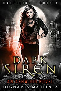 |
| Dark Siren by Dignam and Martinez |
Zoella: This cover is amazing and probably my favourite of the lot. This uses the exact same palette as the earlier one but has more stylistic attachments. All the covers in this series are beautiful, but this one is my favourite. I like how the elegant style of the font is contrasted with the simplicity of the series name font. The designs underneath it, add an extra oomph factor to it. The monochrome provides the drama while red adds the touch of fantasy. This is the kind of cover that inspires( if you are a Suga fan, infires) me to be a designer.
 |
| The Gift by Cecelia Ahern |
Zoella: This is quite a literal cover, but I like it. While it won't be something I will rave about, I appreciate the detailed white designs underneath the ribbon.
 |
| The Year I Met You by Cecelia Ahern |
Zoella: I would've really fallen for this cover if not for the grey buildings. Why did they make it so opaque? It's an ugly mark in an otherwise pretty cover. I love the gradation of colours from red to blue to grey. The patterns on the sky, the two lights hanging on the wire. Everything is beautiful except the grey buildings which resembles rocks jutting out into the city.
My favourite undoubtedly was the Dark Siren. Which was yours?


No comments:
Post a Comment
Let us know what you think.