Hello folks...this is me Hira! It seems like ages since I was last here. I hope Zoe and Jordan have not been boring you to death. Who am I kidding...those two have such opposite tastes that you guys probably had loads of fun watching them fight over book covers...lol.
Anyway, I am sorry I was not around much but my first book is in the editing process (Yes! I have a book...can you believe that?!) and my editor has been kicking my arse. (*Did you know Zoe is a slave driver? I bet you all suspected it). Okay...more about that later, let me focus on Cover Love for now.
This week Inia is going to be my partner in crime as we judge a book by it's cover (I think I am very funny...the others don't). Also a small warning...Most of the covers for this week were chosen by me, so don't judge if you see a pattern (I know my tastes are a bit weird..but hey that's me).
So what are we waiting for....let's dig in!
Hira: Isn't it pretty? Red and black is my favorite combo but you gotta admit that this one is really beautiful. See how the butterfly is breaking off into pieces....it's not very unique but for some reason I can't but be fascinated by it. Also the title, so poetic. If I didn't fall for the cover, I would have fallen for the title, that's sure. And the tag line...I am so hooked! Definitely going into my reading list.
Inia: Ooooooh the cover art is quite pretty! The autumn colours against the dark background looks great. I'm not really digging the title font though...it's obstructing the beauty of the cover art from showing through fully. But the title is brilliant! The book has a very haunting feel about it with that butterfly evanescing against the iron gate and the alluring title.
Hira: Zoe would call this a very clean cover, I think. It's very minimalistic but still intricate. I love the font as well as the branch thingy which looks like a rose. Is it a black rose? If it's a black rose, double kudos from me because I am obsessed with black rose! Also the combo of red and black on a white back drop-love it.
Inia: This cover is so basic yet it works. From a distance and for a limited period of time. At first glance, I thought the cover looked cool and elegant but the more I stare at it, the more plain it seems. And it's so....empty? I can't deduce anything from this cover; the genre, what the story might be about, nothing. Also the review on the cover.... how is that helpful?
Hira: Okay, I don't really like this as a cover. But I had two reasons for picking it. That title (I am a Black Widow Baby! *Rita Ora and Iggy Azalea sings in the background*) And the red head...I love the girl's pose, hair and attitude. A very kickass cover in every sense.
Inia: A spider on your back... this is the stuff of my nightmares *shudder*. Well anyway, the cover is pretty sleek. This looks like a mystery/crime novel. In fact, the aura of mystery surrounding this book is intense. The grey-black colour palate with the splash of red in the title, the byline and the author being secret all adds to the mystique.
Hira: This is Zoe's choice. It took me a solid minute to understand what the picture was. I was like...is it a syringe? No...it's a feather, but no, the shape isn't right. And then I read the title properly, it's a tower and I am an idiot. Black and silver, nice combo. I love the font, but I think the color of it is wrong, it makes it blend too much with the picture.
Inia: Nice title font. I like the black and starry background too. There is nothing much to analyze about the cover. It's clean, well-done and nothing striking.
Anyway, I am sorry I was not around much but my first book is in the editing process (Yes! I have a book...can you believe that?!) and my editor has been kicking my arse. (*Did you know Zoe is a slave driver? I bet you all suspected it). Okay...more about that later, let me focus on Cover Love for now.
This week Inia is going to be my partner in crime as we judge a book by it's cover (I think I am very funny...the others don't). Also a small warning...Most of the covers for this week were chosen by me, so don't judge if you see a pattern (I know my tastes are a bit weird..but hey that's me).
So what are we waiting for....let's dig in!
 |
| Hold Me Like a Breadth by Tiffany Schmidth |
Inia: Ooooooh the cover art is quite pretty! The autumn colours against the dark background looks great. I'm not really digging the title font though...it's obstructing the beauty of the cover art from showing through fully. But the title is brilliant! The book has a very haunting feel about it with that butterfly evanescing against the iron gate and the alluring title.
 |
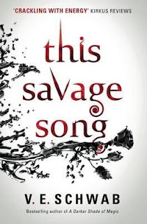
| This Savage Song by V.E. Schwab |
Hira: Zoe would call this a very clean cover, I think. It's very minimalistic but still intricate. I love the font as well as the branch thingy which looks like a rose. Is it a black rose? If it's a black rose, double kudos from me because I am obsessed with black rose! Also the combo of red and black on a white back drop-love it.
Inia: This cover is so basic yet it works. From a distance and for a limited period of time. At first glance, I thought the cover looked cool and elegant but the more I stare at it, the more plain it seems. And it's so....empty? I can't deduce anything from this cover; the genre, what the story might be about, nothing. Also the review on the cover.... how is that helpful?
 |
| Black Widow by Margaret Stohl |
Hira: Okay, I don't really like this as a cover. But I had two reasons for picking it. That title (I am a Black Widow Baby! *Rita Ora and Iggy Azalea sings in the background*) And the red head...I love the girl's pose, hair and attitude. A very kickass cover in every sense.
Inia: A spider on your back... this is the stuff of my nightmares *shudder*. Well anyway, the cover is pretty sleek. This looks like a mystery/crime novel. In fact, the aura of mystery surrounding this book is intense. The grey-black colour palate with the splash of red in the title, the byline and the author being secret all adds to the mystique.
 |
| Ever So Madly by J.R Gray |
Hira: Looks like a very typical romance with a very predictable HEA plot line right? But all of us need a bit of predictability at some point. Looks like the kind of book you pick up when you are in the mood for some fluff and love. Lol...for all I know this could be a heart wrenching story which would make me sob into my pillow for a full day (A girl can hope...we have established that I am weird).
By the way, I love the font and the small explosion thing at the bottom. Also the greenish black backdrop looks nice.
Inia: This has such a pretty colour palette! I can't stop staring at it. I love the pastel hues splotched on the glittery midnight colours and I am mesmerized. I guess the cover is nothing exceptional but the colour scheme more than makes up for the minimalism of the cover art.
 |
| The Thousandth Floor by Katharine McGee |
Hira: This is Zoe's choice. It took me a solid minute to understand what the picture was. I was like...is it a syringe? No...it's a feather, but no, the shape isn't right. And then I read the title properly, it's a tower and I am an idiot. Black and silver, nice combo. I love the font, but I think the color of it is wrong, it makes it blend too much with the picture.
Inia: Nice title font. I like the black and starry background too. There is nothing much to analyze about the cover. It's clean, well-done and nothing striking.
 |
| The Comeback Girl by Katie Price |
Hira: Okay I can guess what you are thinking...finally she has put a cover with some colors in it! Yes, and I love this one. I read the synopsis and you guessed right again..it's about a pop singer. I like the whole vibe the book creates...a typical concert scene. I love the shadow play here. Also, I am a huge music fan and is kinda obsessed with the inner workings of the music industry (I can thank One Direction for that), so definitely giving this one a try.
Inia: Too much bling and glitz oh my god! This reminds me of my High School Musical books and since it's written by none other than Katie Price, I bet the novel is indeed very high school like drama filled. I can't tell if the cover is artistic or trashy since my judgement is very much being clouded by the fact that this is Katie Price's book.
 |
| Between the Notes by Sharon Huss Roat |
Hira: What's with all the poetic titles, this time? It does no look like the kind of book that I would read until someone recommends it to me. It somehow gives the feel of a feel good romance. I love the mix of colors and the white backdrop. It's like a painting on a canvas.
Inia: Pretty design but everything is cluttered and concentrated to a small space and I can't even make out the author's name from it. The cover art has a nice colour scheme though.
 |
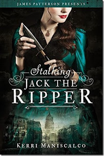
| Stalking Jack the Ripper by Kerry Maniscalco |
Hira: Woohoo, that is one title, I already want to read it. And I love the palette,that hue of green is gorgeous. Doesn't the girl look badass by the way? The story seems to be set a 19th century-ish time...or so I think from my detailed scanning of the cover. Love the details, the super imposing down at the bottom is nice. Also the font is certainly my favorite style. A really good cover.
Inia: I like the aquamarine shade against the black background. The title and cover art are both so intriguing and this seems like the type of book I would pick up to read. I'm all for crime thrillers and this looks like a good one.
Hira: Uhohhh, this is difficult...I have too many favorites this time around. But still I think, Hold Me Like a Breath and Stalking Jack the Ripper takes the prize. Come back Girl and This Savage Song takes a close second place.
Inia: You won't believe which cover is my favourite.. it is Ever So Madly! I know... usually this is so not my type of cover but something about it caught my fancy.


No comments:
Post a Comment
Let us know what you think.