Jordan and Inia are back with Cover Love! We know you've missed us, so let's get right to it.
Inia: Hmm. It's a nice cover but I feel like I see similar ones all the time. That heart made from red broken glass pieces is brilliant though.
Jordan: I love the detailing on the unpolished white hardwood planks. And I'm in awe of the way the glass shards have been arranged. Heartbroken at it's best. I truly like this one.
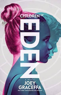
Inia: I didn't know Joey Graceffa wrote books! This is such a cool cover. It's so unique too.. I love the vertical placing of title and the futuristic cover art. Great blend of colours as well; it's striking and it stands out yet there is nothing overpowering about it.
Jordan: While I like the font and the placement of the title, I don't like the cover in its entirety. With its futuristic approach, I feel the image presented could have been better.
Inia: That's a very beautiful mix of blues on the cover page but somehow this book looks boring? I think it's just that HTML font giving me flashbacks to my very boring 10th grade programming classes. The cover page is quite pretty albeit a bit too plain.
Jordan: While I appreciate blue, this is too much blue for me. The cover doesn't not stand out to me in a good way.
Inia: I saw the the word 'Crows' in an vintage swirly font and my mind immediately went "Game Of Thrones!!!". I know it is in no way connected to GOT though it does look like it's also a fantasy novel. Look at that silhouette of a castle against the backdrop of the moon and the clouds. I like the subtle details in this one.
Jordan: I like the cover with its amazing font, that 'art-that-changes-with-perspective' thing they have going on here, and are those sparkles I see? Ooh, I like that.
Inia: Those beautiful intricate designs on the wolf has me mesmerized!! This is such a beautiful cover! That gorgeous font and the striking gold-black colour scheme.. everything is absolutely eye-catchy.
Jordan: I swoon whenever I see the perfect balance of delicate intricacy and wholesome simplicity, and this is definitely one of those swoon-worthy situations. The font, the colours, the sheen, and the details are all remarkable. I would love to get a hard copy of this one.
Inia: I smell a mystery brewing. I hope that blonde woman is that little girl's mother and not the Stranger in Town who is luring the child away into that horrifyingly omnious looking forest. Oh, who am I kidding? That's probably exactly what's happening. I love covers that allow me to play guessing games from the cover art and the byline. This one has a very pretty covert art as well. It looks like a painting, all soft shades and a hazy glow. There is a very appealingly mysterious aura around this book that is making me want to read it.
Jordan: I adore the backdrop, but I find that the blonde pair look as though they were badly photoshopped into the picture. I don't like it.
Inia: Aah, the standard Danielle Steel cover. Most of her covers, like this one, are so comforting. It just makes you feel all warm and fuzzy inside. And knowing the story inside will almost always turn out to be good in a raw, emotional way just heightens these feelings.
Jordan: I love the soothing colour palette used here. The image on the cover links beautifully with the title, while the eggs represent a new life. Danielle Steel at her comforting best.
Jordan: I chose this one to feature here, so obviously, I'm charmed by this. Vintage books have that timeless appeal, and whenever I think of curling up into a blanket with a book and a cup of a tea on a cold, rainy day, it is a book like this with yellowed pages and that wonderful, indescribable scent of old parchment that come to my mind.
I'm pretty sure that our favourites this time are quite predictable: Adrian Tchaikovsky's The Wolf and the Tiger and Lewis Carroll's Alice's Adventures in Wonderland.


No comments:
Post a Comment
Let us know what you think.