
So, are you ready to take this epic journey into the land of books, where only the devout are allowed to enter. It sounds like a pamphlet for a new religion. How about Cover Lovers Anonymous?
Well, enough rambling, onto the covers.


I will definitely read this book. The contrast of orange with blue, sunset with midnight is beautiful. And see the attention to details, the lantern in her hand, the sprinkling of stars in the desert, silhouette of a castle against the setting sun. What is not there to like?
And did I mention, how beautiful the font and the boundary was. For most books of this type, the boundary will be the same on all the four corners., but here it's smaller above and larger below. And the font is neat and elegant and gold. I have a thing for gold fonts.


First reason to love this cover. The genius with which they managed to get the number 13 in the name itself. The cover is minimalistic and the black and white effect will help it stand out in a sea of colours. I don't know why everything is written on wooden planks, I am guessing it has something to do with the story. If you search for uniqueness in this cover, you won't find many. But it is simple and yet manages to stand out, so it definitely gets a place in this list.

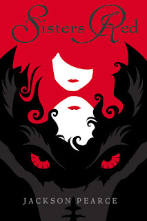
Now, this is the perfect example of a cover that does its job. It has a classic colour scheme, eye-catching illustration and a big bad wolf. We instantly know it's something related to the Little Red Riding Hood.
And from the look on his face, the wolf does not look like a love sick alpha werewolf. Hurray!

This was a book that came on my radar solely because of the cover. The falling Rose petals makes it one of those covers, that makes you stare, stare and stare. And it's nice to see a short haired protagonist once in a while. The font is perfect for fantasy and gives off a dark fairytale felling. Also I love how they added the details of the forest. If you look closely, you can see the branches infront of her too. It's faded, but it adds a touch of irresistible to the cover. Also the font used for the author name is good, especially the W.


Let's see the first one

And did I mention, how beautiful the font and the boundary was. For most books of this type, the boundary will be the same on all the four corners., but here it's smaller above and larger below. And the font is neat and elegant and gold. I have a thing for gold fonts.

I generally don't read sci-fi, but this cover makes me want to try the genre. I like how perfect the clothes are for the characters. The heroine is the only daughter of the worlds richest man, hence the billowing gown and the hero is a soldier, hence the dark, formal clothing.
Usually I don't dig thin fonts, but on this cover, they work beautifully. It works with the illustration, without taking attention away from it. I had seen another version where the fonts were thicker. This one is much much better. And if anyone doubts which genre is it, the sparkling blue nebulas in the background would totally clear that.

First reason to love this cover. The genius with which they managed to get the number 13 in the name itself. The cover is minimalistic and the black and white effect will help it stand out in a sea of colours. I don't know why everything is written on wooden planks, I am guessing it has something to do with the story. If you search for uniqueness in this cover, you won't find many. But it is simple and yet manages to stand out, so it definitely gets a place in this list.
I love all of Cecelia Ahern's covers. They are absolute beauties. That said, it was hard to choose between the book of tomorrow and this one. But A place called here won because of it's colour scheme. Black, golden-yellow and red combo is an absolute winner. The book is so eye catching.

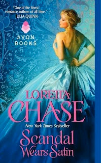
I fell for the colour scheme, again. It's getting to be a pattern.But how can you not include that beautiful blue cover in this feature. Let's starts from the dress, it reflects light and is made of satin. It goes with the title. And see the blue gradient. It's light in the middle and gets darker as we go down. I don't like historical romance covers most of the time, because it's never subtle. I know, it's not supposed to be subtle, but maybe that's why I like the pose this woman strikes, it goes so well with the title.
And let's not forget the background. When it's a thumbnail, you don't notice it much. But when we enlarge the covers, we see the attention to details. Also, it seems to some kind of fabric, which goes perfectly with the story.

And from the look on his face, the wolf does not look like a love sick alpha werewolf. Hurray!

This was a book that came on my radar solely because of the cover. The falling Rose petals makes it one of those covers, that makes you stare, stare and stare. And it's nice to see a short haired protagonist once in a while. The font is perfect for fantasy and gives off a dark fairytale felling. Also I love how they added the details of the forest. If you look closely, you can see the branches infront of her too. It's faded, but it adds a touch of irresistible to the cover. Also the font used for the author name is good, especially the W.
And now for the last book of the day.

(Now, that I notice, most of the books have either a red or blue colour scheme)
Do you know what I like about this cover? Yep, you guessed it, the butterfly. The butterfly which is a tattoo but not a tattoo. It gives it that popping effect. And it sure made this cover stand out.
Follow us on twitter, so that you won't miss another beautiful cover again.
And tell me, which is your favourite?


No comments:
Post a Comment
Let us know what you think.