
Welcome back to another week of Cover Love where we feature eight top voted book covers and give our unbiased opinions on it. Wow, I sound like a talk show host. I found some of these covers from bookstagram (I have started one too @zoellareads), the others were selected by Jordan, Inia and Hira. Even as I write, I haven't yet seen the covers, so my comments will be the first things that come to my mind. Since, others are a bit busy today, It looks like it will be just me and you today.

Zoella: This is one of those covers that look prettier as a hardcover than an ebook (The Elite by Kiera Cass is another example. As much as aI love the font and the typography, the background isn't exciting enough. Personally, I'm not a big fan of the white blurred outlines over the buildings.

Zoella: This book has been on my Amazon cart for a long time now. I haven't got around to buying it yet. I don't know anything about the book, the cover looked interesting and I added it to the cart. Well, that's one way to choose books.
This book would've looked very fantasy-ish if not for the baby pink palette and sunburst effect at the top. I love how the words in the title interact with each other and that addition of the little feather under "A Novel." The picture is cliche, but the extra effect and good font treatment is really helping this book stand out.
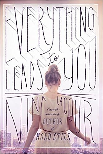
Zoella: I'm in love with this cover.Now, this is how you design a contemporary book cover. The soft colour palette, city n the background to let us know of the setting, the protagonist with face away from us so that we are allowed to imagine her in whichever we want, the amazing font treatment, even the author's name has been included as an organic part of the title and finally the filter like box effect. This is a book I would definitely buy for the cover and not regret it.

Zoella: This cover is umm... weird. The photoshopping of the butterfly onto the apple is good. But this is one of those covers which I will notice but will walk away without a second glance. I'm sorry but I just don't get this cover. Is it about the metamorphosis of a butterfly? Is it about a killer? I get it. It's about a killer butterfly, isn't it?

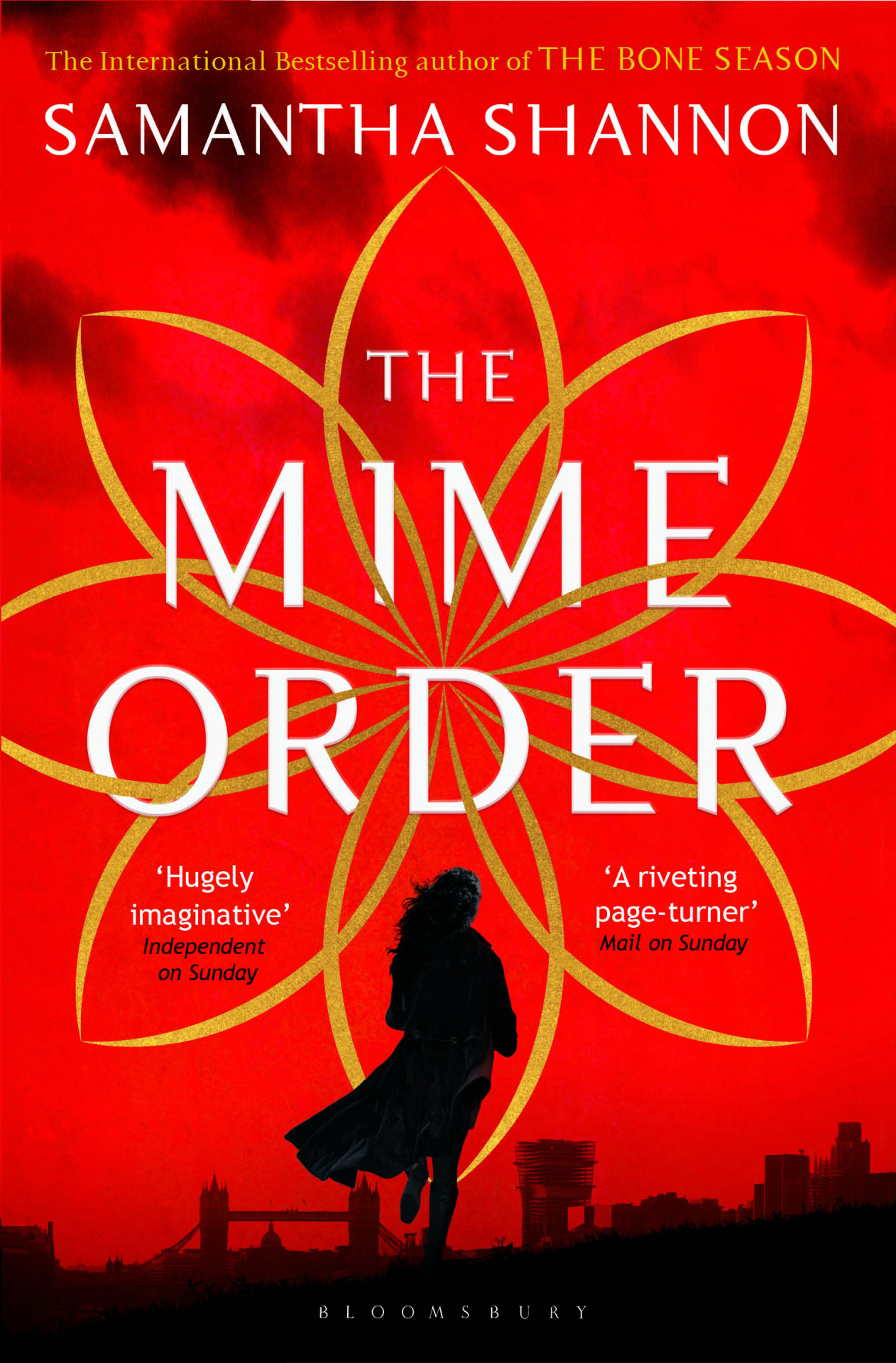
Zoella: A splash of colour on a monochrome cover works.Every.Single. Time. Maybe I should dedicate one week to exploring just those kinds of covers.I love how they have used a feather to hide her face. This way you can have a face on the cover and be free to imagine the protagonist as you wish.The little flourishes at the boundaries are elegant and do not steal away the focus. See the tagline, see how the numbers are going in descending order. This shows me that it has a prominent love triangle(Which I hate, So won't be trying out this book), is set in two worlds; one probably human and other fantasy and one earth shattering secret. The tagline will do an amazing job of reeling the potential readers into buying the books.

Zoella: I loved this book. If you like college romance you should read this. That said I'm not a huge fan of this cover. Thematically, I really like it. This image really shows how it is to feel trapped, with no way to escape. That probably is the only thing I like about this cover. I would've really loved this cover if it was in a different kind of book. But, it just doesn't match the genre and the story.
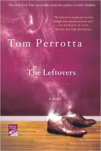
Zoella: Now, this is one interesting cover. Smoke coming off from shoes would've made an impact on its own. But by setting it up against a wider background, it gives off the impression that the man owner of the shoes disappeared into a puff of stroke, midstride. See, you can see whole story there( even though my story might be incorrect). This is a cover that intrigues you. I will certainly be reading this book.\
My favourite book this time was Nina Lacour's Everything Leads To You. This probably is the first time I have selected a non-fantasy book. So, which was your favourite? Let me know.
And if you want to nominate a cover to this feature, feel free to so. We will give you credit while posting.

No comments:
Post a Comment
Let us know what you think.