Hello! It's Hira here! I know you missed me last week...Jordan and Inia can never reach my level of awesomeness right?
Cover Love #10...already? It feels like it was only last week when Zoe came to me with this crazy idea.
So lets make a move and get started on this week's covers!
 |
| Harry Potter and the Cursed Child by J.K Rowling |
Jordan: The shiny gold makes it look like an Easter egg. I am not a fan of the wings; they look very sketchy and out of place, like it's a last minute addition. Overall, I don't find the cover very
impressive.
Hira: It's a snitch! I am disappointed in myself...I can't believe it took me so long to get the connection. I have to admit I was not very impressed by the cover when it was first revealed, mainly because it looked nothing like the other Harry Potter covers, but then I heard Zoe praising the cover and took a proper look at it. The details of the nest and the black wings are pretty good. Also the golden color is quite beautiful too. But overall I don't find it very attractive (maybe because of how disappointing I found the book to be.)
 |
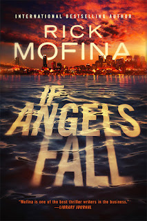
| If Angels Fall by Rick Mofina |
Jordan: The scattering of clouds across the reddish orange sky and the contrasting blue waves beneath make it a very eye-catching cover. I love the way even the font seems as thought it's immersed in waves. The receding backdrop of the city make it seem as though you are moving away from it.
Hira: This is my type of cover.The waves and the title written across it is quite catchy. The reddish-blue sky and the city lights in the distance...I love this cover.
 |
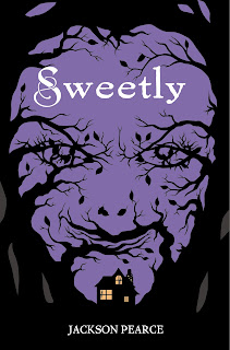
| Sweetly by Jackson Pierce |
Jordan: It looks creepy. So creepy, that I won't pick it up. The way the branches curve around to form a person's face is quite ingenious and the white swirly font of the title and the title itself make the cover seem ironic.
Hira: I don't what to talk about this cover because it disturbs me a lot. This is a book I will ever read.
 |
| Thorn by Intisar Khanani |
Jordan: I don't gravitate towards fantasy books. Since, it clearly seems like one, I don't like it. I don't like the way the colours meld into each other and the other elements in the cover seems tacky.
Hira: I thought this was a historical romance cover, to be honest. But whatever. I like the title and it's font. The palette is just a bit too bright for me. And I usually tend to stay away from covers with a lot of gardens, flowers and shit.
 |
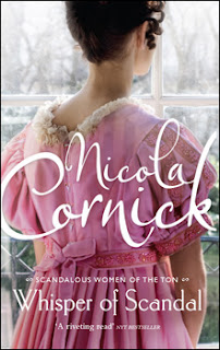
| Whisper of Scandal by Nicola Cornick |
Jordan: Pastel colours and white fonts give me life. The woods outside seen through the frosty windows, the blush coloured dress and the demure pose the woman embodies-are all details that make you appreciate it even more, after you've stared at it for hours.
Hira: Nope. Not my cover again. It seems too off somehow. I did like the font but otherwise not a cover which I would give a second glance.
 |
| It Ends with Us by Colleen Hoover |
Jordan: I would grab this just for the cover. The pale hardwood floor makes a beautiful backdrop for the destroyed flower. The dark hints of lilac-ish red seems like splattered blood, and the green of the stalk highlights the main colour.
Hira: I think it's evident by now that Jordy's and my taste in covers are polar opposites. I did like the scattered petals and the overall palette but I don't like the font or the design.
 |
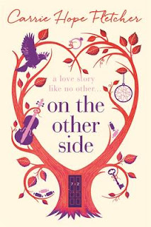
| On the Other Side by Carrie Hope Fletcher |
Jordan: I see a bird, a key, a dream catcher, a ring, a guitar, and some candy. The tree curving into a heart and the door in the tree trunk gives it a whimsical feel. I also find the color scheme quite interesting.
Hira: I feel this is a over-used style which is done to give the appearance of uniqueness. The violet and red combo works well...but the tagline is barely visible. Again not really my style.
 |
| Sweet Tomorrows by Debbie Macomber |
Jordan: I would love to go on a weekend trip to this place and curl up till next Monday. The fairy lights, the hammock with the comfy blankets and the throw cushions,,,, aah, bliss. I adore the cover.
Hira: Okay, this one I like. It gives of the vibe of summer and solitude. The scenery, the lights and all those cushions...I might be in love. The palette is very very beautiful.
Hira: I loved Sweet Tomorrows and If Angels Fall. I think I like the later a bit more since it's a first time that a cover of that type is shown here.
Jordan: And my favourite is Sweet tomorrows.For once we are agreeing Hira!


No comments:
Post a Comment
Let us know what you think.