Friday, 11 November 2016

Splintered by A.G Howard | A Review | #reviewfriday


If I were to say Alice in Wonderland what would you think of? A cute blonde girl and her little adventure? Well brace yourself because A.G Howard  is going to change (perhaps, forever) the way you think of it.
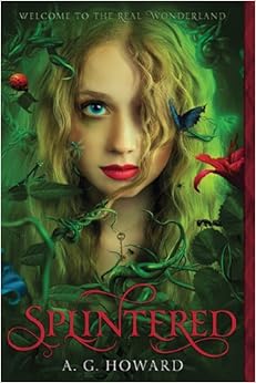
Splintered by A.G Howard review
Splintered by A.G Howard


Title: Splintered
Author: A.G Howard
Genres:  Young adults, fantasy, romance.

So, a few days ago I was watching videos of people's library tours and, among the sea of books in this girl's library, one captured my attention: Splintered.

So I went and looked for it on Goodreads and read the plot. It took me a few times to understand it but when I got it I rushed to get the book. What can I say? I love original and weird things and this book is definitely both. 

Now that I talked about my first impression let's get to the real stuff, shall we?


  • The story is original even if the author took a very well known story.
  • This book is full of details like every good written book should be.
  • The characters have defined personalities and are not dull.
  • Romance and fantasy are well balanced and make you crave for more, more and more.
  • It is a mind blow until the very last page and will make you want to devour the other two books in no time. (like I'm doing now)

Alyssa’s character can be really hard to get and makes many mistakes of that make her seem like any other human. That’s normal, you would say, but if you pay attention you’ll notice that the author probably spent a good amount of his time studying how a peoplewould react, what decisions they would make or hoe they would express their emotions. And so it is for every other character in story.

That’s probably one my favourite parts in a supernatural or fantasy story, when the writers create surreal creatures and think them through: details, behaviour and culture included; creating new worlds that will make you stick your nose between the pages and never get up to study or work.

So if you decide to read this book you’ll notice that some characters are really hard to understand and, until the very end, you will not understand what is going on in their little brains.

The writing style is very lucid yet intricate but if you’re not a native English  speaker or you have just started reading in English, then I suggest you keep Google Translate or Wordreference as your reading buddy. To be honest, in certain scenes I was confused and had to read the them a few times to understand what was happening, not because I didn’t understand the words but because a few points weren’t crystal enough. If you’re a native speaker or are already comfortable with the language you can just chill in your cozy seat and enjoy this good read.


All I’m going to say about the end is that left me surprised and honestly I expected it to end in a very different way but I understand the author’s decision and I am satisfied with it because not everything can happen in the first book.
Personally I ship Alpheus (Alyssa and Morpheus) and I really recommend you this fantastic book.

My rating is 4 / 5


About the reviewer

The name's Naila, I'm a reader, fangirl and Wattpad writer. I'm from Italy and have an endless list of fictional husbands. One of my hobbies is creating ship names. You can find me on Instagram, Wattpad, and Goodreads 

If you also want to contribute to our community through articles,short stories,  reviews e.t.c about books please click on the guest writer tab above. 

Saturday, 5 November 2016

Cover Love #21

 Welcome back to another week of Cover Love where we feature eight top voted book covers and give our unbiased opinions on it. Wow, I sound like a talk show host. I found some of these covers from bookstagram (I have started one too @zoellareads), the others were selected by Jordan, Inia and Hira. Even as I write, I haven't yet seen the covers, so my comments will be the first things that come to my mind. Since, others are a bit busy today, It looks like it will be just me and you today.
                                          
Image result for vassa in the night


Zoella: This is one of those covers that look prettier as a hardcover than an ebook (The Elite by Kiera Cass is another example. As much as aI love the font and the typography, the background isn't exciting enough. Personally, I'm not a big fan of the white blurred outlines over the buildings.


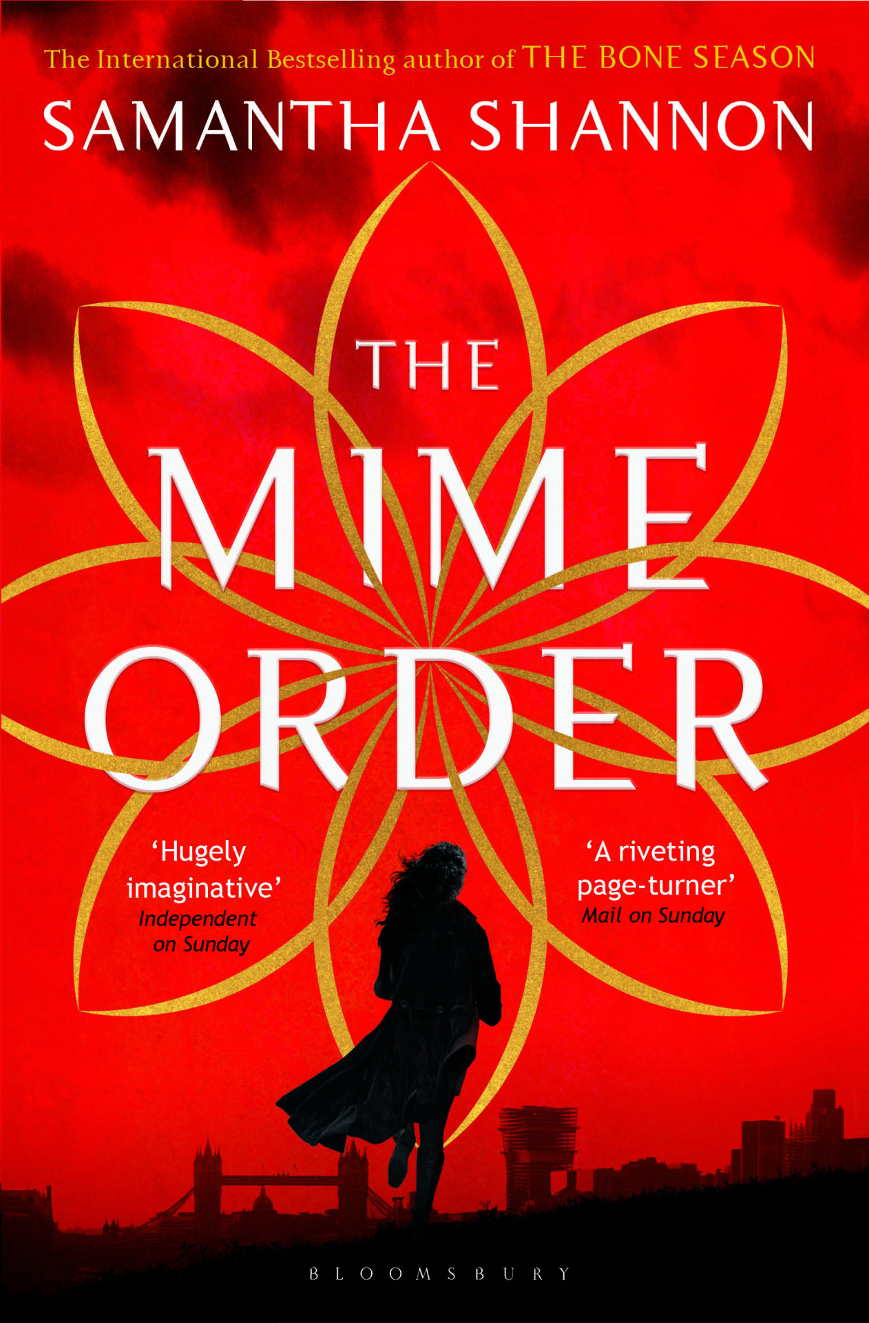
 Image result for mime order

Zoella: I found many different versions of this cover. Most of them featured this symbol on a plain red or textured background. That was when I saw this. The addition of silhouttes has made a world of change. I have heard many saying that they loathe seeing people on covers. But in my case, I love covers with people. It adds a kind of intimacy and comfort that you don't find in other covers. And they look pretty. Which way do you prefer your covers *winks*).


                                                        Image result for tonight the streets are ours

Zoella: This book has been on my Amazon cart for a long time now. I haven't got around to buying it yet. I don't know anything about the book,  the cover looked interesting and I added it to the cart. Well, that's one way to choose books.
This book would've looked very fantasy-ish if not for the baby pink palette and sunburst effect at the top. I love how the words in the title interact with each other and that addition of the little feather under "A Novel." The picture is cliche, but the extra effect and good font treatment is really helping this book stand out.

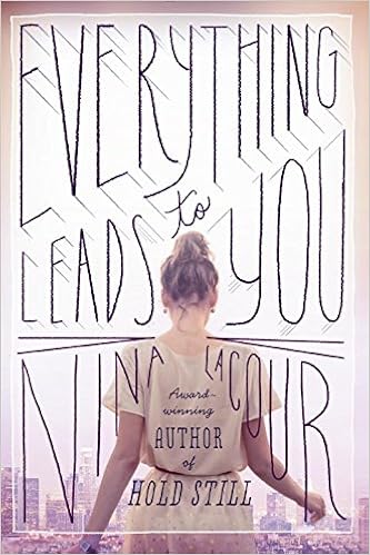
                                                         Image result for nina lacour books

Zoella: I'm in love with this cover.Now, this is how you design a contemporary book cover. The soft colour palette, city n the background to let us know of the setting, the protagonist with face away from us so that we are allowed to imagine her in whichever we want, the amazing font treatment, even the author's name has been included as an organic part of the title and finally the filter like box effect. This is a book I would definitely buy for the cover and not regret it.


Zoella: This cover is umm... weird. The photoshopping of the butterfly onto the apple is good. But this is one of those covers which I will notice but will walk away without a second glance. I'm sorry but I just don't get this cover. Is it about the metamorphosis of a butterfly? Is it about a killer? I get it. It's about a killer butterfly, isn't it?


Zoella: A splash of colour on a monochrome cover works.Every.Single. Time. Maybe I should dedicate one week to exploring just those kinds of covers.I love how they have used a feather to hide her face. This way you can have a face on the cover and be free to imagine the protagonist as you wish.The little flourishes at the boundaries are elegant and do not steal away the focus. See the tagline, see how the numbers are going in descending order. This shows me that it has a prominent love triangle(Which I hate, So won't be trying out this book), is set in two worlds; one probably human and other fantasy and one earth shattering secret. The tagline will do an amazing job of reeling the potential readers into buying the books.


Zoella: I loved this book. If you like college romance you should read this. That said I'm not a huge fan of this cover. Thematically, I really like it. This image really shows how it is to feel trapped, with no way to escape. That probably is the only thing I like about this cover. I would've really loved this cover if it was in a different kind of book. But, it just doesn't match the genre and the story.

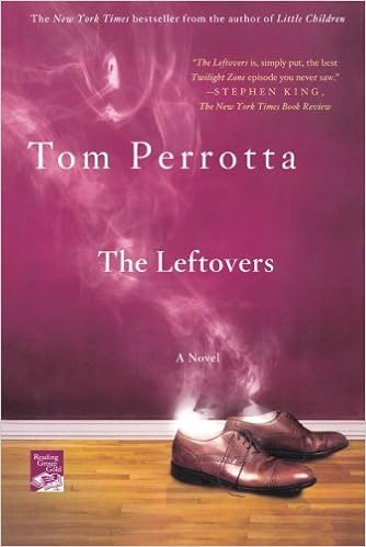
                                                              Image result for tom perrotta the leftovers

Zoella: Now, this is one interesting cover. Smoke coming off from shoes would've made an impact on its own. But by setting it up against a wider background, it gives off the impression that the man owner of the shoes disappeared into a puff of stroke, midstride. See, you can see whole story there( even though my story might be incorrect). This is a cover that intrigues you. I will certainly be reading this book.\

My favourite book this time was Nina Lacour's Everything Leads To You. This probably is the first time I have selected a non-fantasy book. So, which was your favourite? Let me know.
And if you want to nominate a cover to this feature, feel free to so. We will give you credit while posting.