And we are back again with this weeks's Cover Love. While all of us have pitched with in with the recommendations for this week, you all will get to hear only Jordan's amazing critiqe this time. All the better, I say. I'm awesome at what I do!

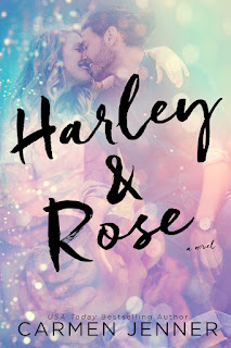
Jordan: What I like about this cover is that it doesn't follow the usual dark colour theme this genre entails. A very welcome and attractive change. I like the textured background. This cover is simplistically eye-catching. I am interested enough to give this a read.

Jordan: At first glance, it seemed like a mermaid. Is that a mermaid? While I'm not a fan of the different fonts for the title or for the byline, that underwater picture gives me the chills.

Jordan: Those warm tones of the flower, especially the gold and the pink, clash with the cool tones of the background. A cover with the potential to be great, this one just missed the mark for me.

Jordan: I have a special fondness for the combination of the hues of pink and blue and I do like this one, too. That title font could do with some more, though. A different colour, perhaps?

Jordan: That picture gives a whole new meaning to the phrase "guard your heart". I like how uncluttered this cover is. And I suppose this would look really majestic as a hard bound book.
Jordan: Barbed wires are certainly popular this season. While I don't really get the significance of the trident-like symbol, I appreciate the image all the same. The texture of the background is quite realistic. I like it.
Jordan: I love this quaint cover. That smoking matryoshka doll, and that title! I'm going to get my hands on this book as soon as possible.
Jordan: I would love to actually hold this book in my hands. Something tells me this one is sure to be a beauty. I love the colours, the images, and that vintage font. And the byline's font is a classic that works every time.
It's time to choose and I'll go with Anna Blundy's Neat Vodka. It's one of those covers that definitely deserves a second look.


No comments:
Post a Comment
Let us know what you think.