Thursday, 30 June 2016

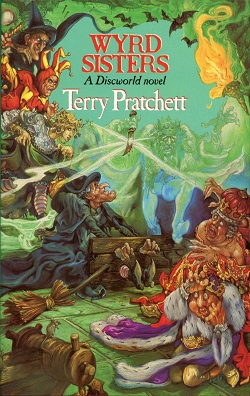
Wyrd Sisters-- #6 Discworld Series by Terry Pratchett II #reviewfriday


It was an abomination of a crime that I had committed against myself-- going without reading Terry  Pratchett for so long. Pratchett is an awe-inspiring author. If Shakespeare and Wodehouse could ever decide that the world needs their combined protege, then he is it, but even better! 

You need to read this book in the proper ambience. First of all, get yourself a steaming cup of English breakfast tea and gear up to read out loud in your posh-est British accent. (Try to imagine that you're the Queen in a top hat, that usually helps.) A word of caution: read this book away from people who might judge you for giggling, snorting and occasionally choking on your own saliva because you were laughing so hard.


Wyrd-sisters-cover.jpg


Title: Wyrd Sisters--  #6 Discworld Series (First Published: 1988) 
Author: Terry Pratchett
Genre: Fantasy, Historical fiction

Now where do I start from? The characters and the plot lines are all over the place and yet, tightly held together in this amazing creation. This gigantic monstrosity of an ensemble delivers everything from 'three witches' to 'divers alarums' (that last phrase is particularly discussed upon a lot in the book). 

Long story short: The king dies, a duke arrives, the kingdom doesn't like the evil duke, and so three witches go about restoring the rightful heir to the throne. But the way they go about doing it, now that is a riot (or three, in this case). With numerous allusions to Shakespeare's Macbeth and Hamlet, and even to Shakespeare himself (there is a character named Hwel who is, surprise, a playwright); this piece of work is ingenious. 

The title characters are none other than the three witches, and they completely alter any preconceived notion you have had about witches while managing to reinforce it all the same. So Granny Weatherwax, Nanny Ogg and Magrat Garlick are the three not-so-menacing witches whose sole mission seems to be to meet for copious amounts of tea (I approve of that) while trying their hardest not to get involved in the kingdom's politics. Throw in the king's ghost, a baby, a travelling group of actors, a potential love interest for the not-so-well-endowed youngest witch (a couple of peas are mentioned, that is all you are hearing from me); all that results in utter chaos, a fifteen-year time warp and a play.

While I know that I have been blabbering on and on about the book, and yet not about the book, the truth is that it is definitely a non-transferable experience. The blatantly humorous lines and the subtle comedy that leaves one breathless, it's all there and you need to read it to believe it. I could wax poetic about this book for ages and it still wouldn't be enough. So, read it. Definitely read it. What are you waiting for, go get this book! 

Rating: 5/5


Cover Love #4


And we are back again...This is the fourth week of Cover Love. A month old already. Wow! So in celebration of turning a month old this week's cover love is specially themed. All the covers below are in beautiful hues of blue. 


(Also like last week...both Zoella and I will be giving our opinions on each cover)


So what are you waiting for..dig in!


Hira: Interesting. That's the first word that comes to my mind about this cover. In some ways the image reflects the name of the novel. The stories where messages were sealed in bottles and thrown into the sea hoping it would reach the dead...the picture oddly brings those stories back to my mind. The bluish white palate is so beautiful yet it gives out signs of gloom. And notice the details like the waves hitting the city shores. Also the overall 3D effect the bottle gives out is just so good.

Zoella: This cover is unique. I love how the reflection of the city shows a spooky ship travelling through treacherous mists. And like Hira said about the waves under the city- the attention to detail is applause worthy.I am not a big fan of the typography; it gets cut off at the ends, which I don't like. But that is just my opinion.


Hira: Very intriguing. The name is The Raven King but oddly the cover focuses on a stag. The stag is painted in a wonderful blend of black and blue which is difficult to take your eyes off. It's the color of copper crystals and is one of my favorite shades of blue. For this reason alone I love the cover. Also check out the black ravens on the side...a stark contrast against the white. The artist who made this cover is obviously very very clever.

Zoella: I love love love this cover. The texture, the color, the details everything. It's a brilliant piece of work. See how the fabric like texture swirls to form an eye. The gradient in the ear, colors going from dark to light just like real ears (even though real ears are not blue). It's a beautiful cover and an even more beautiful story. Highly recommended.
Warning. This is not a standalone, it's a fantasy series.


Hira:  A mysterious blend of blue and red, with a font which is all lines and curves.  The dragon on the top and the smoke like swirls of white in between add to the mystique element . But I don't find this cover that striking mainly because I dislike this shade of blue as well the combination of blue and red.

Zoella: This is not my favorite cover of the series, but I like it. I always love it when the title interacts with the rest of the cover. Like in this case, where it curves around the castle and whatever it is that is behind it.. Love the addition of dragon, but I wish it was part of the title, like it billows up from the letter e maybe. But nevertheless, it's a good cover.


Hira:  It certainly is a gorgeous cover. But somehow it feels as though I have seen it before. I cannot find anything unique about the cover. Despite this I love the background image of the sun breaking though the clouds.

Zoella: The Orphan Queen; love the title. For me, the main attraction was the typography, while it is not very unique, that along with the main image just drew me in. This cover promises me political drama and magic and possibly a strong heroine. It's the kind of book I wanna read.

Hira: The blue that is the color of sky with navy colored font. The woman tangled in a web of roots...that seems very deep (*bad pun*). Or is the web protecting her from a free fall? The cover certainly pokes around inside your head, asking questions which make you want to pick the book up and search for the answers. Again, a very clever design.

Zoella: I agree, it's a clever design. It makes you ask questions, doesn't it? It's interesting how the tree branches seem to be helping the woman and trapping her at the same time. Is it a woman? I think it is. Can't be sure though. But the main attraction of the cover is the review quote, from the king himself. That should have been made bigger. The cover is intriguing and tempting enough for me buy it. My TBR pile just keeps growing *sigh*.


Hira: I don't know why but it brings to my mind the imagery of Mid Summer Night's Dream. The whole cover gives off a magical vibe. And with the full moon in the back..magic, love, miracles...they all seem like possibilities. The little lights on the branches are really beautiful and add to the feel. But again, even this cover does not feel remarkably unique to me.

Zoella: This cover is not unique. The design has been done to death. But it still has that evergreen appeal. Because it's a beautiful, magical and romantic cover and the color palette used is a personal favorite of mine, so I'm biased.


Hira: If this does not look like the film poster of a raunchy rom-com, I don't know what does!. I love the blend of colors. The bluish-white with the reddish-yellow...the meeting of day and night? A dusk or dawn? Or is the blue the sky and the red the hell (or earth)? Also the man and woman at the bottom...so definitely a love story. I also love how the big title is fitted into the whole thing to give off a magnificent air.Very very interesting cover. 

Zoella: I adore the color palette. Such rich contrast. The dark hue of the buildings saves it from blending too much into the background. Beautiful typography. The cover is certainly loud, but it is loud in a way you love. Like an annoying little sibling. I have wished, I could tape my brother's mouth shut. But, if someone asks who is my favorite person in the world. I only have one answer. My brother.

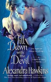
Hira: The only book I have read in this lot. All the book by Hawkins have covers which concentrate on one color. It's obviously a regency romance. And I vouch it's a good one. I personally loved the font a lot. But I have seen prettier covers from Hawkins. So, not one of my favorites.

Zoella: I am not a big fan of Historical Romance covers, because it's too straightforward for me. I love the drama of colors, eye-catching typographies and layers and layers of details. All of which I find in Fantasy covers but not in regency romances. So, this cover while certainly beautiful on comparison with its contemporaries. It does nothing for me. This is one of those, it's not you, it's me situation.


So Zoe (*hey, that rhymes*) which is your favorite from this week? I personally loved the Passenger and Even if the Sky Falls a lot.  And I am guessing you loved them too.
Ooooh, good selection. Mine were Passenger, The Raven King and 13 minutes. So those were our favorites. Which ones were yours?


Saturday, 25 June 2016

Book Nerd Problems #2

Hi guys....and yes it's another Saturday and we are back again with another Book Nerd Problem. After all we book nerds never run out of problems do we? Just last day I was complaining to my Dad about how difficult it is to get hands on some books...even in this era where everything is at your fingertips, can you believe it.

Anyway....back to the Book Nerd Problem of the week....


Come on...this has happened to all of us, right? Tell us all about the book you have wished it for!


Friday, 24 June 2016

Aristotle and Dante Discover the Secrets of the Universe by Benjamin Alire Sáenz || #Reviewfriday

I first heard about this book on Instagram. Someone I followed had posted a picture of this book and given a positive feedback. Obviously the first thing that caught my attention was the gorgeous book cover. It was so unique and very very intriguing. But I am not going to spent more time gushing over this book cover  (I think I talked more than enough about it in yesterday's cover love feature)

Other than the cover the one other thing which had caught my interest was the fact was it was a book which talked openly about sexuality and self discovery. Like Inia, lgbtq issues are something which I feel strongly about and for long I had wanted to read a book which portrayed it realistically. After having read Inia's review of Captive Prince, my interest grew and I felt that a book  telling the sweet story of two young boys was the perfect way to officially step into the world of LGBTQ literature. (Believe me, I have read more than enough fan fictions...but I wanted to read a published book of the trope).

I guess I have given more than enough information about my reasons for reading it. It's time I talked a bit about the book itself. 

Not an affiliate Link

Title: Aristostle and Dante Discover the Secrets of the Universe
Author: Benjamin Alire Saenz
Genre: LGBTQ fiction, Romance, Coming of Age, Bildungsroman

When I checked out goodreads (i.e the new age Bible of book addicts like us), it described the genre of the book as young-adult and bildungsroman.
Now I don't know if I am the only one new to that word. But, what the hell is bildungsroman? As usual when in trouble, approach google!


Bildungsroman
ˈnoun
  1. a novel dealing with one person's formative years or spiritual education.


And yes, that's exactly what the book does. Benjamin Alire Sáenz tells the novel from the point of view of  fifteen year old Aristotle. The novel leads us through his growth, his frustrations and his self-discovery, openly discussing the topic homosexuality. The book was heart touching due to the innocence and simplicity which clearly shines through every page. 

Ari is a loner and comes from a family filled with secrets. His father a war veteran who barely talks anymore, his much older brother is in prison and everyone in his family pretty much pretends he does not exist. And Ari himself is just becoming a man and is confused with himself; his body and his thoughts. It is at this point that Ari meets the open and easy going Dante at a swimming pool. Dante is the opposite of Ari at first glance. He is philosophical, artistic and is not afraid to face the fact that he is into boys. In fact, the ease with which he accepts his homosexuality seems to startle Ari. But as the book progresses Ari learns to love words and realizes that he is more like Dante than he thought.

The one thing I thoroughly enjoyed about this book, was the fact that the author never went into a information dump or a monologue. Things are never explicitly said but everything is revealed through the actions. Though the book is from Ari's point of view, the readers are left to form their opinions about Ari though his actions rather than words. As a writer, I feel that being able to express something in such a way is a unique talent.

The book has been divided into various sections and each section marks a change in Ari, or so I had felt. In addition to pursuing the idea that love is free, equal and is for all, the book also talks about topics like friendship and family. The strong family support that both Dante and Ari receives as well as the special friendship that they share are explored quite well.

Aristotle and Dante takes the readers into their world and let's them be a part of their adventures. The novel is more like a movie than a book in the aspect that it keeps the readers guessing. It is a book which brought a smile to my face as I finished the last sentence and one that I will remember with fondness. I would say it's definitely worth a read. And if I had to rate it...it will be a solid 5/5, nothing less.


The Awards :

Stonewell Book Award, 2013
Honor Book, Michael L.Printz Award, 2013
Pura Belpré Author Award, 2013


  1.  

Thursday, 23 June 2016

Cover Love #3

Yes, another week of cover love. As usual, I will be selecting top 8 covers that caught my fancy. I haven't limited myself to just one genre. These are the best covers from Sci-Fi, Fantasy, Romance, Dystopian, Illustrated, Contemporary and Historical.


And to make things more interesting Hira is also joining us to spread more cover love. (Seems only fair since she is as book crazy as I am) So without further ado, let's jump right in.


Hira: I came across this book very randomly. The title of course was catchy but what really attracted me was the awesome font which covers the better part of the page. The overall feel of the cover was so good that I couldn't wait to get my hands on it. The greyish-white designs on the side and the red truck on the side all blended to give it a certainly unique looks. Kudos to the designer for bringing life to an original scene from the book. 

Zoella: Don't know which is better, the cover or the awards that adorn the cover. For me this is an ideal book: it has a good cover and an even better story. This is not my ideal cover, but that's because I am more into Kick-ass Fantasy.
The typography is just beautiful. Not only does it manage to artfully arrange a long title in a compact space but it also managed to highlight the keywords by changing the font size. The little white designs add so much more character to the cover. Because after reeling you in with an eye catching central image, it gives you something to savour too. 
I am going to read this book, not only because it has a good cover but also because it comes highly recommended from Hira. You know you've got to try it when Hira recs something.


Hira: Zoella loves her kickass heroines and this one is bound to get her pumped up. I am not much into fantasy but a book cover like this just might make me run through the first few pages. And that shows the power of the cover. The blue and white palette with a bit of grey in it is quite common but somehow always manages to look interesting and unique.

Zoella: You know me so well. I love covers like this because, it has a sword and a kickass heroine. The sword coming through the title is a nice touch. It adds a bit more 3-Dimensionality(is that even a word?) to the cover.
Usually fantasy covers use a bit more elaborate fonts. But this one works different from the rest. It shows that the story is more serious and the violence will be greater and stakes higher. I agree with H about the palate. And securing the series name between two flourishes is common, but tucking them away from the title at the bottom of the cover is not. But it works.


Hira: I was actually surprised to see this in Zoe's list. Mainly because she is not as into historical romance as yours truly. But I am glad to see Eloisa's cover here a) Because I love the author b)Because all her covers are awesome. Seriously you need to check out her covers...or maybe we will feature them in the coming weeks. Coming to this one specifically, the blue gown. If that is not an eye-catcher. And the whole Cinderella feel with the huge staircase in the background. Who wouldn't be tempted?

Zoella: What works for me is the fact that, it's a clean cover. You got a woman in a regency gown and an opulent staircase behind her. The tile is also doesn't have so much flourish as to make it unreadable. It's a very minimalistic design and works well in attracting new readers.


Hira: Ethereal. That's one word I have for this cover. The whole font reminds me of Katy Perry's Firework MV. The cover succeeds in creating a feel of mystique and intrigue.

Zoella: I had loved the first book cover(Impervious) and I love the second one too. It's not everyday you see a short haired heroine, and it drew me in. The colour palette: violet and orange is beautiful. And I am in love with that sea of fireflies. Quoting Hira, so unearthly. And I adore that font.


Hira: The tagline. OMG the tagline. Also the really hot backside of a muscly guy does not hurt either. Not at all...*ahem* (Come on...we all have some guilty pleasures). The violet and indigo font matching the girl's gloves...while everything else is in black and white...that was a cool idea.

Zoella: We both were gushing over that tagline. This has definitely earned a place in our TBR pile. I love covers which splashes colour on a black and white background. The concept itself is cool. But what earned this cover a place here was the fact that, it had not not only had a double coloured title, but also because the gloves were also coloured. So, it's not simply a romance, it's a romance between a fighter female and a hot hero. The cover is minimalistic and yet conveys all the keep points about the novel. The tagline just seals the deal.
FYI: Notice how bra is in a different colour. Is it because the subject is female or was unintentional. It's funny anyway.


Hira: Zoe will tell you I am addicted to the color red and it's true. But tell me who wouldn't love that red stiletto. The font is quite fancy but it works for the cover since it seems to be giving of a posh vibe in it's entirety. Certainly makes the reader turn it backwards and read the blurb.

Zoella: Another minimalistic cover, am I detecting a trend here. The title is actually steampunkish instead of screaming Sci-Fi. But, nevertheless it's beautiful. I have read this book and the plot is good. It's basically fairytale in science fiction. See how her leg is transparent. It confused me for a while, whether its a metal leg or a human one. But after reading the novel, I know the cover is just perfect and the confusion(maybe it was only me) suited the story.


Hira: The red stiletto again! And this time with a trident in the end to match the title. The cover successfully conveys what the whole style of the book is. And to be honest, it's one of those books which you will want to own just for the cover or maybe just for that clever title.

Zoella: These covers are perfect for you H. It's in your favourite combo: red and black. The cover is just clever. And i don't think you need our help to figure out why we all love this cover.


Hira: Cinderella meets Princess Diaries. My favorite thing about this one is obviously the crown above the title and the gorgeous font. I have a weakness for fonts which give of an elegant royal feel, I admit. The palate is again bluish-white which is very common but still always manages to look unique.
Zoella: I love the dress and the hairstyle. But I am not a big fan of the font. But one thing I did notice in the whole series of covers is that( this the last installment of the trilogy), the size of the title kept becoming bigger. Maybe as the heroine becomes more and more important, the title becomes more and more enlarged. It was a nice touch. The tagline is also intriguing.

Yayy, another week of cover love wrapped up. My favorite among these were Crushed and Brawler. Which was yours Hira?

Hira: Wow, now I know why you get so excited about this feature. Some of these covers are pure awesome. My favorites have to be Brawler (And no, it's not because of the the half-naked guy in the poster) and Cinder. Which are yours?


Saturday, 18 June 2016

Book Nerd Problems #1

Hello Folks! We are starting a new feature just for YOU (if you've never read a book, then this is not the place for you *points at the door*).

So last day me and Hira were chatting (obviously) and we talked about little things that irks book nerds like us. Things that non-reader will never get.

"You have so many books, Why do you need more?"  How can anyone ask any self-respecting book-lover  such a question? Note this down people- I'm greedy when it comes to books. It's always that way- the more, the better. It's the same for Hira...who am I kidding, she is worse.

Anyway back to the matter at hand. Our chat on books. This feature you see now is an evolution of those chats.We were having so much fun texting back and forth, we thought you shouldn't be kept out of it (yes, we are generous souls, I know).

 So, ladies and gentlemen, please welcome our new feature Book Nerd Problems. If you have ever experienced these problems, then know that you are never alone.


Pin it, tweet it, share it. It's all your wish.
What Irked you when you read a book. Share below and who knows, it may even be featured here.


Relax, I'm a Ninja by Natalie Whipple|| #reviewfriday

I love ninjas. I love their garb, their dark uniforms, their gleaming swords and their never ending bag of tricks. So, when I saw a Ninja story and not just any Ninja story, but one that had demonical aspect of it(you'll get the pun, when you read the book), I jumped on the chance to read it. Relax, I'm a Ninja is an young adult paranormal romance(don't know if I can classify it like that), written from the male protagonist's point of view.

First off, I have to give you a warning. Six of Crows by Leigh Bardugo had set a new standard for me. That book was a subtle tornado. The writing was subtle, but the emotions evoked were powerful. And I will try my best to judge this book without comparing it to that one, because that will be totally unfair, seeing how it is set in two different worlds.

Click to Buy
Not an affiliate link.


Seeing as I'm more a fan of discussing a book, than writing a review, I will write it in bullet points. That way it's better for everyone. If you want to ask anything specific about the book, then drop me a comment and I will reply back.

Title: Relax, I'm a Ninja

Author:Natalie Whipple

Genre: Y.A, fantasy, Asian martial arts

Blurb: A Clan of ninjas in San Francisco may sound improbable—but as the son of a ninja master, Tosh Ito knows what lurks in the shadows of his city. Or at least he thought he did.

When a killer with a poisoned blade starts cutting down teens, Tosh enlists Amy Sato—newest ninja recruit and his best friend’s crush—and sets out to uncover the killer’s identity. What they find is ninjutsu more evil than they could have ever imagined.

As Amy and Tosh grow closer, they discover their connection unleashes a legendary power that could stop the murders. Problem is, that power may be exactly what the killer is looking for, and wielding it could cost them both their souls.
 
  • I loved how well Tosh was written. For a female author to pull off writing in first person a teenage boy's story is not that easy. So kudos to Natalie.
  • This is more of a corollary of the first point. Tosh goes from seeing Amy as his best friends crush to falling for her hard. The way he thinks about her at first, the emerging feelings, getting over his long term crush and falling for Amy, all of it was realistically portrayed. Even though there were a few places where I doubted whether I was in a teenage boy's head, for most of the time, I felt like I was reading about a real person.
  • Amy-the female protagonist: she is not flawless, she is not a pushover and she is definitely not one to stand back when some other girl makes grabby hands at Tosh. Her impulsive and competitive nature, her shyness, her jealousy, I could see it all even when it was written from Tosh's point of view.
  • The plot twists were clever and well placed. The last one didn't come off as a big surprise, probably because the author didn't want to make it a big surprise. Overall, I liked the pacing of the book. 
  • The secondary characters, the friends as well as adults were well fleshed out. In most of the Y.A books, they are absent or even if they are present, are mostly cardboard cutouts. The book was a welcome diversion from that.
  • Now let's talk about my favorite part- Book cover. I liked the book cover because of the fonts. It was big, bold and looked like glowing brush strokes. I don't know whether it was intentional, but the glow is an important part of the book. That said, if it wasn't for the title, I probably would have skipped the book. Because a guy in a hoodie, no matter how mysterious is not the cover I would expect for a fantasy ninja book.
So, do I think it's worth the time?
Yes, it was. And I recommend it for those who love Ninjas, nerds and male P.O.Vs.

Rating:3.5/5


Wednesday, 15 June 2016

Cover Love #2

I am not kidding, when I say this is my favourite feature in the blog. This features inspire me to make my own awesome covers, and I made one last day inspired by Cover Love#1. I will post the link when it is uploaded to the site.

So, without wasting time, let's see which is today's Top 8. You can check it out on our pinterest too.


And the first cover of the day.
Cover Love:The Girl in The Ice-Robert Bryndza

Kudos to the designer for taking a cliche cover and completely revamping. I mean can I just say OMG. It's simple and yet layered. The blue ice and dirt, the slightly transparent font and an eye-catching cover scheme. This is a book I want to own.

Cover Love: Concealed-Amber Lynn Natusch


This is a novella in the caged series, and it has the best cover among all of them. Eye is the common theme, but the other covers are plain compared to this. Electric blue staring at you through a keyhole, it's quite eye-catching isn't it( excuse the pun). And it goes perfectly well with the title. I love it when that happens.

Cover Love: Defiance - C.J REdwine

This books has been in my radar for a long time. I will read it one (promise). It seems to have all the things I like ofr in a book; a kickass heroine who wears practical clothings (the cape is awesome if not practical), some connection with forrest and a political struggle. My ideal book would be a kickass Urban fantasy mystery, something like Ilona Andrews' Kate Daniel and Hidden Legacy series.
I love the colour of her clothes, a happy marriage between black and violet. The cape is a nice touch. I also love how we are able to see the kingdom through the cape. It looks as if she is protecting it. I hadn't noticed that before!
I didn't like the second book in this series very much (the cover, not the book), because it was more navy bluish in colour.

Cover Love: Crooked Kingdom-Leigh Bardugo

Crooked kingdom is the second in the Six of Crows series by Leigh Bardugo. If you read fantasy , you have to read Six of Crows. It's AMAZING, I kid you not. I am going around recommending this to everyone who would listen. It's that good. This is an epic fantasy told from six point of views. I loved how subtly the author portrayed the emotions of the character, their conflicting motivations and hidden passion. It's brilliantly written and is quite fast paced. What makes this a must read is the fact that the author made me believe that the characters were real, she made me root for unlikable heroes and unlikely alliances.

I liked the cover of Six of Crows too, but this one is better. At first I had thought, oh it's just another cover with a crow(they are quite popular bird among book designers), but then I saw the three palaces in yellow ( I hadn't even realized there were three), and an entire city in black (at the very bottom). But as much as I admire the illustration, I can't muster the same enthusiasm for the title and author font.The author name is almost unreadable. The title font is okay-okay, not my type. But the book is amazing.
You have to read this book*stares*

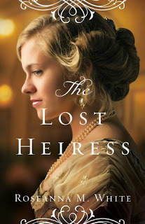
Cover Love: The Lost Heiress-Roseanna.M.White

You know I am fan of details, of eye-catching colour schemes, but once in a while that part of takes a nap. This cover is a golden beauty, it's simple, it conveys the genre and the font is not overpowering. 
Roseanna is a fellow cover designer, I don't if she designed this cover but it is beautiful. But that said, I am not a big fan of how the flourishes are cut off in the top and bottom corners.


This book, makes me wanna, hug this book to chest, curl up in a corner and take a nap (and blissfully ignore the world)
It's hard to stand out in the sports romance genre, because all the covers feature, shirtless hunks who may or may not showcase their gears(hihi). So, it's really up to the title to make it stand out.
And this one nails it. Hop pink title on a black and white picture, what stands out more than that. Even the way the words are arranged shows the care that has gone into making this cover. It's not another, we have a hot shirtless guy to drool over, who cares about the typography. Well, I am glad this wasn't one such designer.
Cover Love: A Thousand pieces of you-Claudia gray
So you really need any explanation for why this cover is on today's top 8. The water colour look, the colour scheme (a monotonous real world and colourful other world) and beautiful typography, nuff said.

This last one like the Lost Heiress belongs to the simple but beautiful category.

Cover Love: A Beautiful kind of Broken-Katie Ganshert

The beauty of this cover lies in it's simplicity. It conveys what it need to and that's it. It is one of those covers that makes you nostalgic because you remember similar books that you've loved in the past.

That's it for todays Top 8. Which was your favourite? Tell me which one cover that you want to see featured here before you die.


Cover Love #1


I love covers, I gush over them, I buy books just own those beautiful book covers. Is it any wonder I became a book cover designers. I don't know if you like book covers, but I do and if you do too, then hang around because I am starting a new feature just to showcase those pretty covers. I am that mad about them. I will be pulling 8 covers from various genres, sometimes fantasy may predominate but that's because they have the best covers(not at all biased, I know. *grins*)

So, are you ready to take this epic journey into the land of books, where only the devout are allowed to enter. It sounds like a pamphlet for a new religion.  How about Cover Lovers Anonymous?

Well, enough rambling, onto the covers.


Let's see the first one
the star touched queen-roshani chosky

I will definitely read this book. The contrast of orange with blue, sunset with midnight is beautiful. And see the attention to details, the lantern in her hand, the sprinkling of stars in the desert, silhouette of a castle against the setting sun. What is not there to like?

 And did I mention, how beautiful the font and the boundary was. For most books of this type, the boundary will be the same on all the four corners., but here it's smaller above and larger below. And the font is neat and elegant and gold. I have a thing for gold fonts.


these broken stars-amie kauffman, meaghan spooner

I generally don't read sci-fi, but this cover makes me want to try the genre. I like how perfect the clothes are for the characters. The heroine is the only daughter of the worlds richest man, hence the billowing gown and the hero is a soldier, hence the dark, formal clothing.

Usually I don't dig thin fonts, but on this cover, they work beautifully. It works with the illustration, without taking attention away from it. I had seen another version where the fonts were thicker. This one is much much better. And if anyone doubts which genre is it, the sparkling blue nebulas in the background would totally clear that.


thirteeen reasons why-jay asher

First reason to love this cover. The genius with which they managed to get the number 13 in the name itself. The cover is minimalistic and the black and white effect will help it stand out in a sea of colours. I don't know why everything is written on wooden planks, I am guessing it has something to do with the story. If you search for uniqueness in this cover, you won't find many. But it is simple and yet manages to stand out, so it definitely gets a place in this list.

A place called here- cecelia ahern

I love all of Cecelia Ahern's covers. They are absolute beauties. That said, it was hard to choose between the book of tomorrow and this one. But A place called here won because of it's colour scheme. Black, golden-yellow and red combo is an absolute winner. The book is so eye catching.

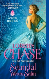
Scandal wears satin-loretta chase


I fell for the colour scheme, again. It's getting to be a pattern.But how can you not include that beautiful blue cover in this feature. Let's starts from the dress, it reflects light and is made of satin. It goes with the title. And see the blue gradient. It's light in the middle and gets darker as we go down. I don't like historical romance covers most of the time, because it's never subtle. I know, it's not supposed to be subtle, but maybe that's why I like the pose this woman strikes, it goes so well with the title.

And let's not forget the background. When it's a thumbnail, you don't notice it much. But when we enlarge the covers, we see the attention to details. Also, it seems to some kind of fabric, which goes perfectly with the story.

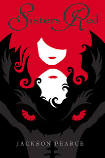
sisters red-jackson pearce


Now, this is the perfect example of a cover that does its job. It has a classic colour scheme, eye-catching illustration and a big bad wolf. We instantly know it's something related to the Little Red Riding Hood.

And from the look on his face, the wolf does not look like a love sick alpha werewolf. Hurray!

impervious-laura kirwan

This was a book that came on my radar solely because of the cover. The falling Rose petals makes it one of those covers, that makes you stare, stare and stare. And it's nice to see a short haired protagonist once in a while. The font is perfect for fantasy and gives off a dark fairytale felling. Also I love how they added the details of the forest. If you look closely, you can see the branches infront of her too. It's faded, but it adds a touch of irresistible to the cover. Also the font used for the author name is good, especially the W.

And now for the last book of the day.

walking disaster-jamie mcguire

(Now, that I notice, most of the books have either a red or blue colour scheme)
Do you know what I like about this cover? Yep, you guessed it, the butterfly. The butterfly which is a tattoo but not a tattoo. It gives it that popping effect. And it sure made this cover stand out.

Follow us on twitter, so that you won't miss another beautiful cover again.

And tell me, which is your favourite?